library(here)      # manage file paths
library(socviz)    # data and some useful functions
library(tidyverse) # your friend and mine06 — Extend your Vocabulary
February 14, 2024
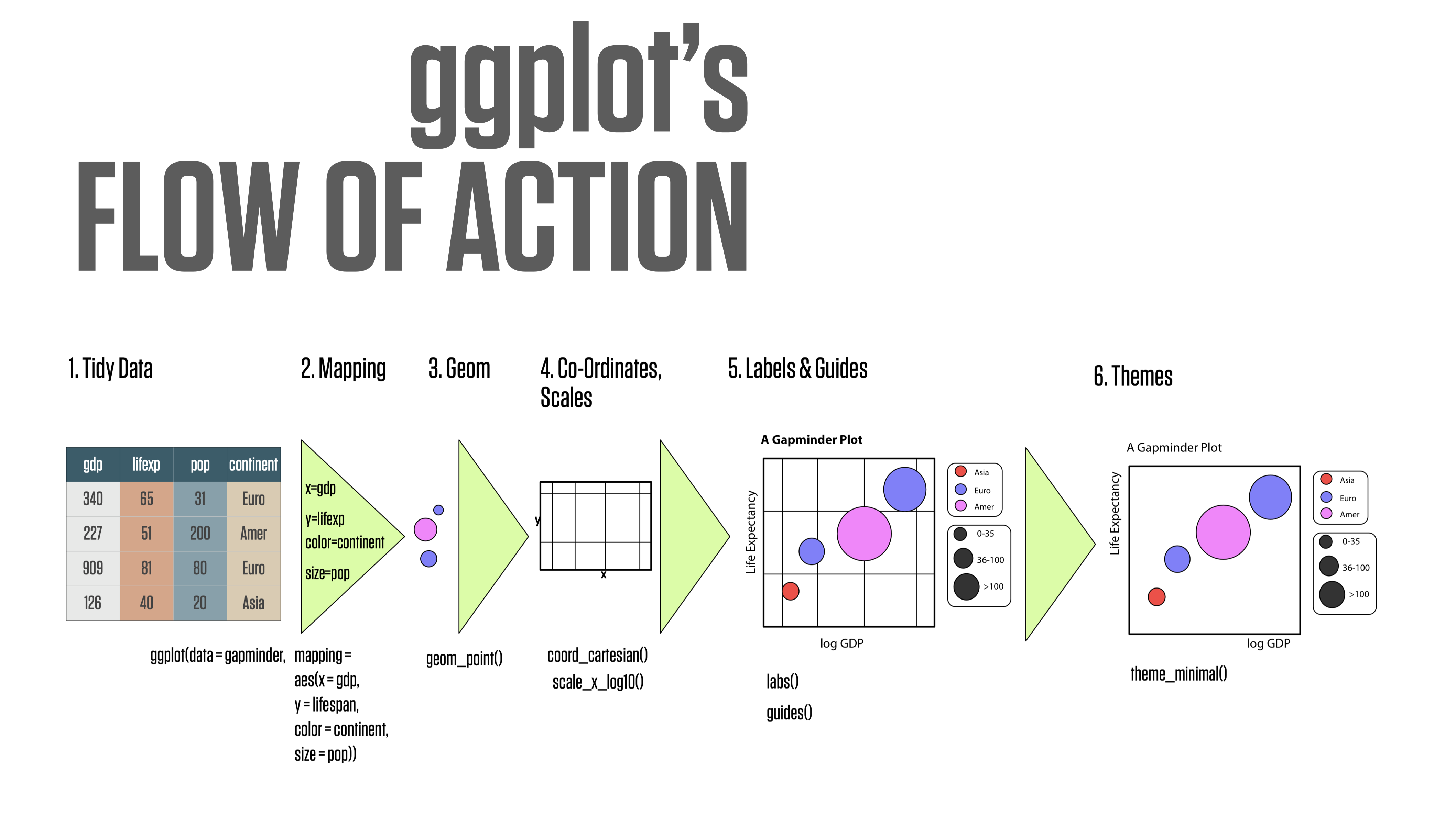
ggplot’s flow of action

Thinking in terms of layers
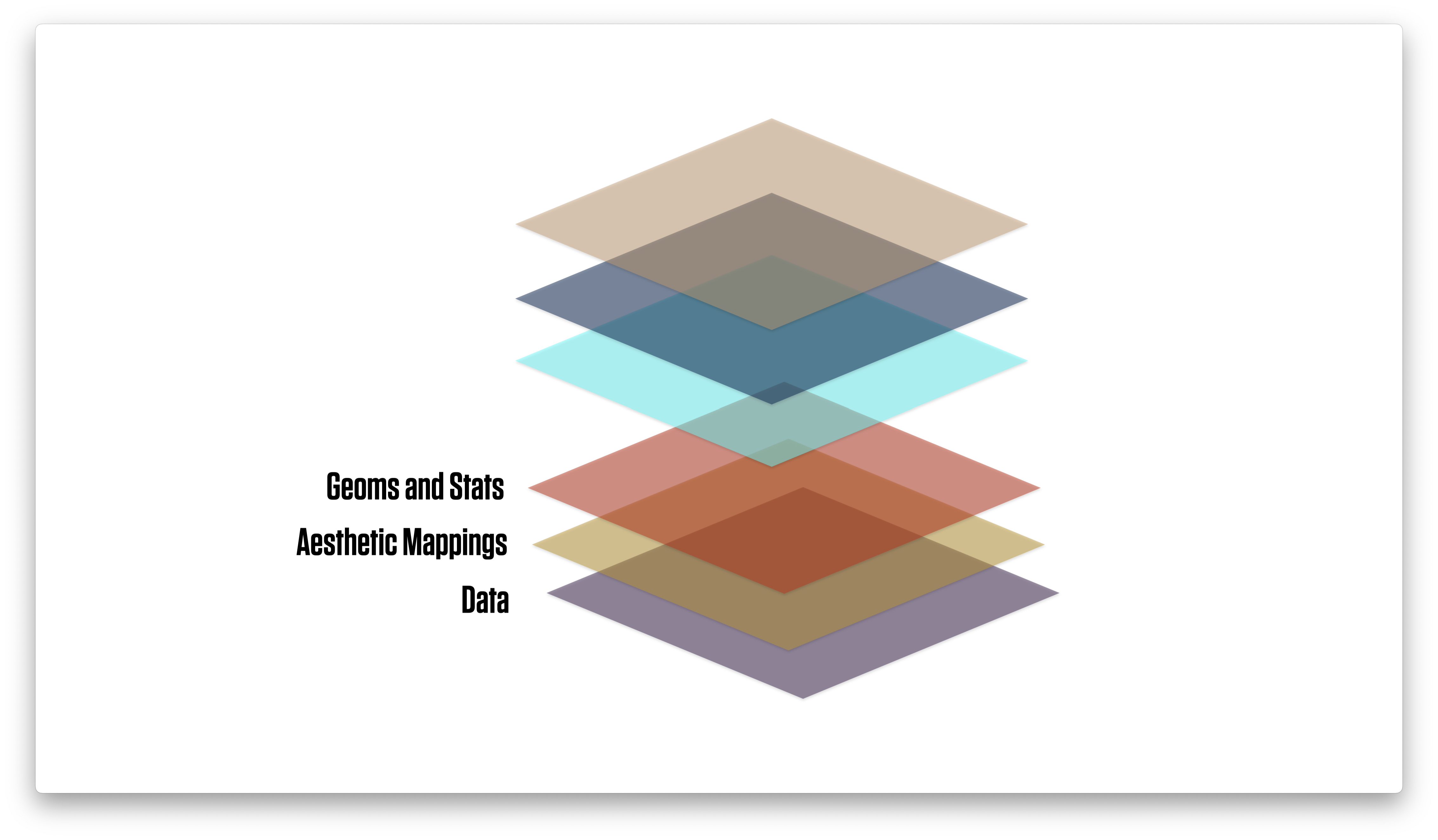
Thinking in terms of layers
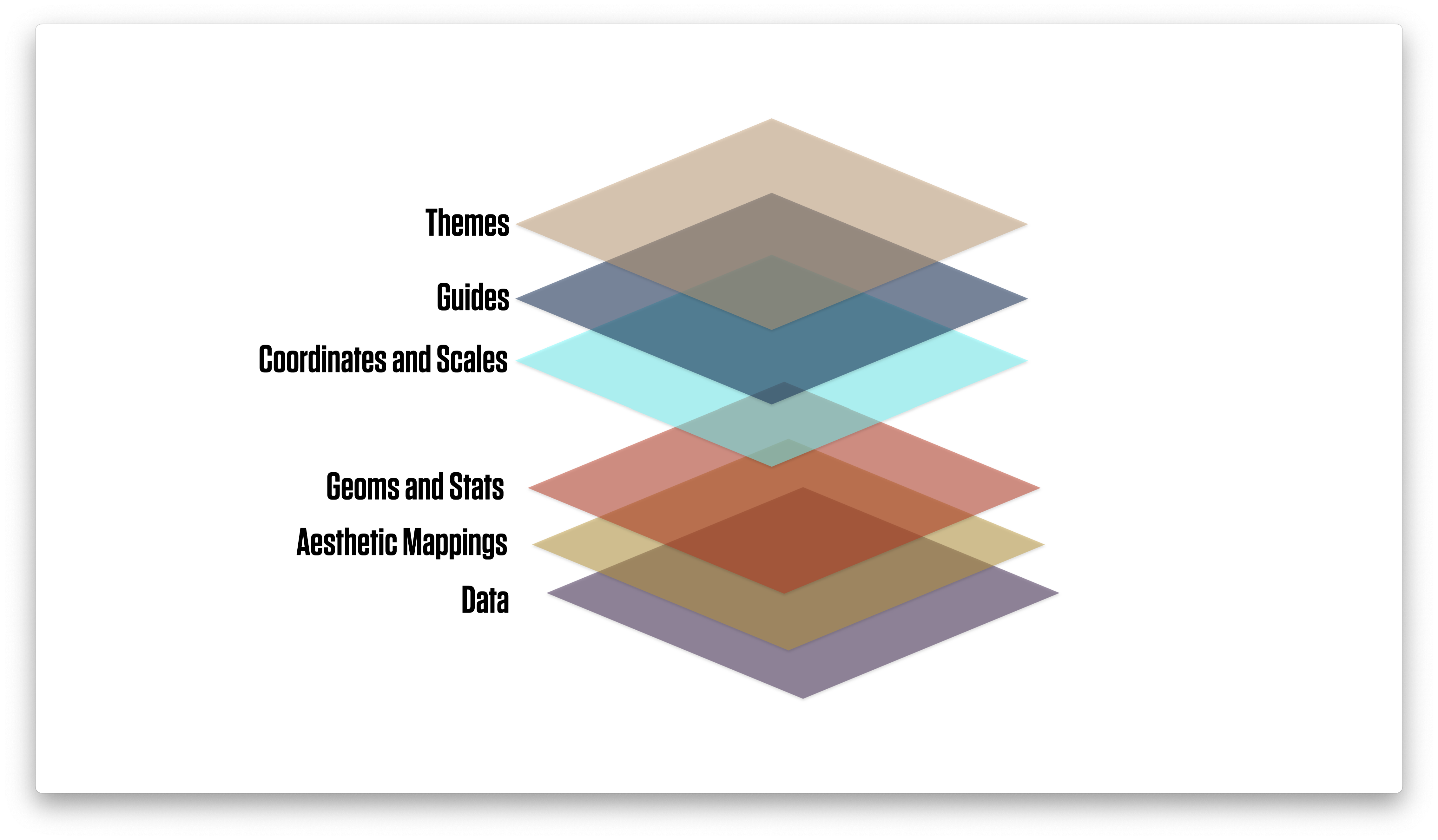
Thinking in terms of layers
First look
p <- ggplot(data = organdata,
            mapping = aes(x = year, y = donors))
p + geom_point()
First look
p <- ggplot(data = organdata,
            mapping = aes(x = year, y = donors))
p + geom_line() 
First look
p <- ggplot(data = organdata,
            mapping = aes(x = year, y = donors))
p + geom_line(aes(group = country)) 
First look
p <- ggplot(data = organdata,
            mapping = aes(x = year, y = donors))
p + geom_line() +
  facet_wrap(~ country, nrow = 3)
First look
p <- ggplot(data = organdata,
            mapping = aes(x = year, y = donors))
p + geom_line() +
  facet_wrap(~ reorder(country, donors, na.rm = TRUE), nrow = 3)
First look
p <- ggplot(data = organdata,
            mapping = aes(x = year, y = donors))
p + geom_line() +
  facet_wrap(~ reorder(country, -donors, na.rm = TRUE), nrow = 3)
Boxplots: geom_boxplot()
## Pipeline the data directly; then it's implicitly the first argument to `ggplot()`
organdata |>
  ggplot(mapping = aes(x = country, y = donors)) +
  geom_boxplot()
Put categories on the y-axis!
organdata |>
  ggplot(mapping = aes(x = donors, y = country)) +
  geom_boxplot() +
  labs(y = NULL)
Reorder y by the mean of x
organdata |>
  ggplot(mapping = aes(x = donors, y = reorder(country, donors, na.rm = TRUE))) +
  geom_boxplot() +
  labs(y = NULL)
(Reorder y by any statistic you like)
organdata |>
  ggplot(mapping = aes(x = donors, y = reorder(country, donors, sd, na.rm = TRUE))) +
  geom_boxplot() +
  labs(y = NULL)
geom_boxplot() can color and fill
organdata |>
  ggplot(mapping = aes(x = donors, y = reorder(country, donors, na.rm = TRUE), fill = world)) +
  geom_boxplot() +
  labs(y = NULL)
These strategies are quite general
organdata |>
  ggplot(mapping = aes(x = donors, y = reorder(country, donors, na.rm = TRUE), color = world)) +
  geom_point(size = rel(3)) +
  labs(y = NULL)
geom-jitter() for overplotting
organdata |>
  ggplot(mapping = aes(x = donors, y = reorder(country, donors, na.rm = TRUE), color = world)) +
  geom_jitter(size = rel(3)) +
  labs(y = NULL)
Adjust with a position argument
organdata |>
  ggplot(mapping = aes(x = donors, y = reorder(country, donors, na.rm = TRUE),
                       color = world)) +
  geom_jitter(size = rel(3), position = position_jitter(height = 0.1)) +
  labs(y = NULL)
Plot our summary data
by_country |>
  ggplot(mapping =
           aes(x = donors_mean,
               y = reorder(country, donors_mean),
               color = consent_law)) +
  geom_point(size=3) +
  labs(x = "Donor Procurement Rate",
       y = NULL,
       color = "Consent Law")
What about faceting it instead?
The problem is that countries can only be in one Consent Law category.
by_country |>
  ggplot(mapping =
           aes(x = donors_mean,
               y = reorder(country, donors_mean),
               color = consent_law)) +
  geom_point(size=3) +
  guides(color = "none") +
  facet_wrap(~ consent_law) +
  labs(x = "Donor Procurement Rate",
       y = NULL,
       color = "Consent Law")
What about faceting it instead?
Restricting to one column doesn’t fix it.
by_country |>
  ggplot(mapping =
           aes(x = donors_mean,
               y = reorder(country, donors_mean),
               color = consent_law)) +
  geom_point(size=3) +
  guides(color = "none") +
  facet_wrap(~ consent_law, ncol = 1) +
  labs(x = "Donor Procurement Rate",
       y = NULL,
       color = "Consent Law")
Allow the y-scale to vary
Normally the point of a facet is to preserve comparability between panels by not allowing the scales to vary. But for categorical measures it can be useful to allow this.
by_country |>
  ggplot(mapping =
           aes(x = donors_mean,
               y = reorder(country, donors_mean),
               color = consent_law)) +
  geom_point(size=3) +
  guides(color = "none") +
  facet_wrap(~ consent_law,
             ncol = 1,
             scales = "free_y") +
  labs(x = "Donor Procurement Rate",
       y = NULL,
       color = "Consent Law")
Again, these methods are general
by_country |>
  ggplot(mapping =
           aes(x = donors_mean,
               y = reorder(country, donors_mean),
               color = consent_law)) +
  geom_pointrange(mapping =
                    aes(xmin = donors_mean - donors_sd,
                        xmax = donors_mean + donors_sd)) +
  guides(color = "none") +
  facet_wrap(~ consent_law,
             ncol = 1,
             scales = "free_y") +
  labs(x = "Donor Procurement Rate",
       y = NULL,
       color = "Consent Law")
geom_text() for basic labels
by_country |>
  ggplot(mapping = aes(x = roads_mean,
                       y = donors_mean)) +
  geom_text(mapping = aes(label = country))
It’s not very flexible
by_country |>
  ggplot(mapping = aes(x = roads_mean,
                       y = donors_mean)) +
  geom_point() +
  geom_text(mapping = aes(label = country),
            hjust = 0)
There are tricks, but they’re limited
by_country |>
  ggplot(mapping = aes(x = roads_mean,
                       y = donors_mean)) +
  geom_point() +
  geom_text(mapping = aes(x = roads_mean + 2,
                          label = country),
            hjust = 0)
We’ll draw a plot like this
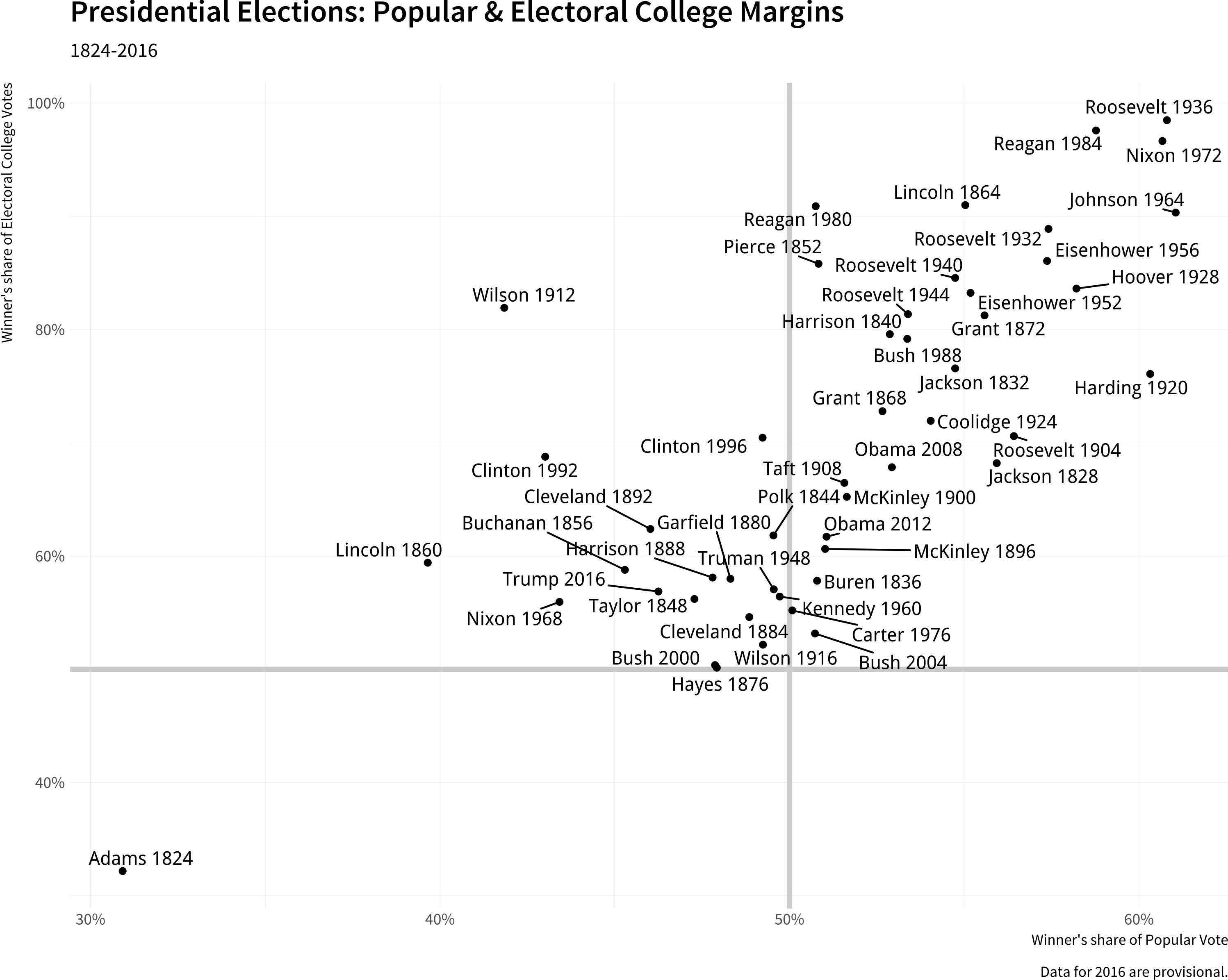
Presidential elections
Base Layer, Lines, Points
p <- ggplot(data = elections_historic,
            mapping = aes(x = popular_pct,
                          y = ec_pct,
                          label = winner_label))

p + geom_hline(yintercept = 0.5,
               linewidth = 1.4,
               color = "gray80") +
    geom_vline(xintercept = 0.5,
               linewidth = 1.4,
               color = "gray80") +
    geom_point()
Add the labels
This looks terrible here because geom_text_repel() uses the dimensions of the available graphics device to iteratively figure out the labels. Let’s allow it to draw on the whole slide.
p <- ggplot(data = elections_historic,
            mapping = aes(x = popular_pct,
                          y = ec_pct,
                          label = winner_label))

p + geom_hline(yintercept = 0.5,
               linewidth = 1.4, color = "gray80") +
  geom_vline(xintercept = 0.5,
             linewidth = 1.4, color = "gray80") +
  geom_point() +
  geom_text_repel()


Option 1: On the fly in ggplot
by_country |>
  ggplot(mapping = aes(x = gdp_mean,
                       y = health_mean)) +
  geom_point() +
  geom_text_repel(data = subset(by_country, gdp_mean > 25000),
                  mapping = aes(label = country))
Option 1: On the fly inside ggplot
Stuffing everything into the subset() call might get messy
by_country |>
  ggplot(mapping = aes(x = gdp_mean,
                       y = health_mean)) +
  geom_point() +
  geom_text_repel(data = subset(by_country,
                                gdp_mean > 25000 |
                                  health_mean < 1500 |
                                  country %in% "Belgium"),
                  mapping = aes(label = country))
Option 2: Use dplyr first
This makes things neater. A geom can be fully “autonomous”. Each one can have its own mapping call and its own data source. This can be very useful when building up plots overlaying several sources or subsets of data.
by_country |>
  ggplot(mapping = aes(x = gdp_mean,
                       y = health_mean)) +
  geom_point() +
  geom_text_repel(data = df_hl,
                  mapping = aes(label = country))
annotate() can imitate geoms
organdata |>
  ggplot(mapping = aes(x = roads,
                       y = donors)) +
  geom_point() +
  annotate(geom = "text",
           family = "Tenso Slide",
           x = 157,
           y = 33,
           label = "A surprisingly high \n recovery rate.",
           hjust = 0)
annotate() can imitate geoms
organdata |>
  ggplot(mapping = aes(x = roads,
                       y = donors)) +
  geom_point() +
  annotate(geom = "rect",
           xmin = 125, xmax = 155,
           ymin = 30, ymax = 35,
           fill = "red",
           alpha = 0.2) +
  annotate(geom = "text",
           x = 157, y = 33,
           family = "Tenso Slide",
           label = "A surprisingly high \n recovery rate.",
           hjust = 0)
Scale functions in practice
- Scale functions take arguments appropriate to their mapping and kind
organdata |>
  ggplot(mapping = aes(x = roads,
                       y = donors,
                       color = world)) +
  geom_point() +
  scale_y_continuous(breaks = c(5, 15, 25),
                     labels = c("Five",
                                "Fifteen",
                                "Twenty Five"))
More usefully …
organdata |>
  ggplot(mapping = aes(x = roads,
                       y = donors,
                       color = world)) +
  geom_point() +
  scale_color_discrete(labels =
                         c("Corporatist",
                           "Liberal",
                           "Social Democratic",
                           "Unclassified")) +
  labs(x = "Road Deaths",
       y = "Donor Procurement",
       color = "Welfare State")
The guides() function
- Control overall properties of the guide labels.
- Common use: turning it off.
- We’ll see more advanced uses later.
organdata |>
  ggplot(mapping = aes(x = roads,
                       y = donors,
                       color = consent_law)) +
  geom_point() +
  facet_wrap(~ consent_law, ncol = 1) +
  guides(color = "none") +
  labs(x = "Road Deaths",
       y = "Donor Procurement")
The theme() function
theme() styles parts of your plot that are not directly representing your data. Often the first thing people want to adjust; but logically it’s the last thing.
## Using the "classic" ggplot theme here
organdata |>
  ggplot(mapping = aes(x = roads,
                       y = donors,
                       color = consent_law)) +
  geom_point() +
  labs(title = "By Consent Law",
    x = "Road Deaths",
    y = "Donor Procurement",
    color = "Legal Regime:") +
  theme(legend.position = "bottom",
        plot.title = element_text(color = "darkred",
                                  face = "bold"))
Sidenote: Smoothers
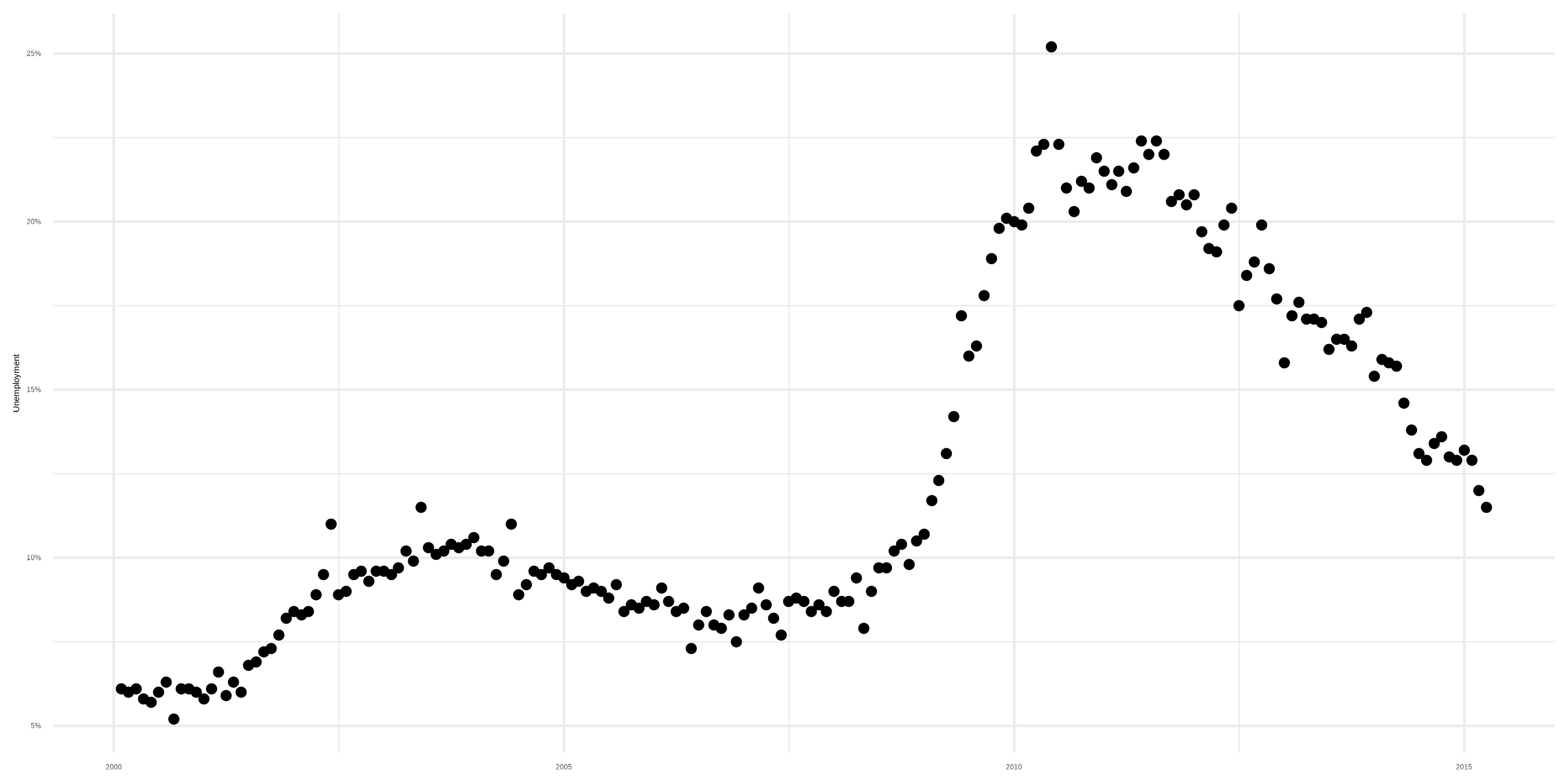
A trend
Sidenote: Smoothers
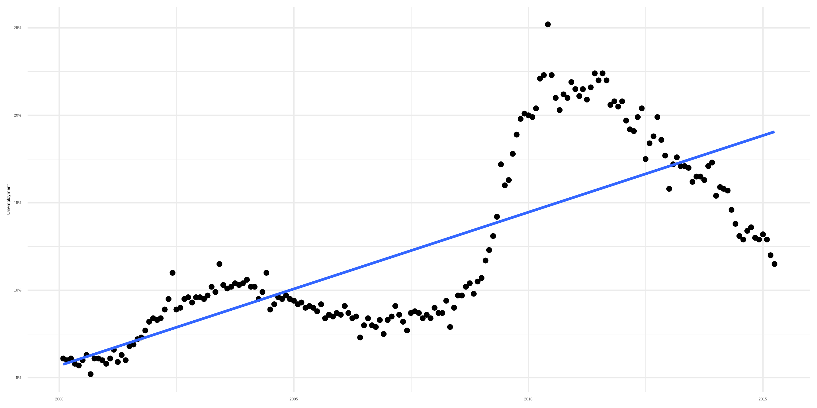
Smoother with bad linear fit
Sidenote: Smoothers
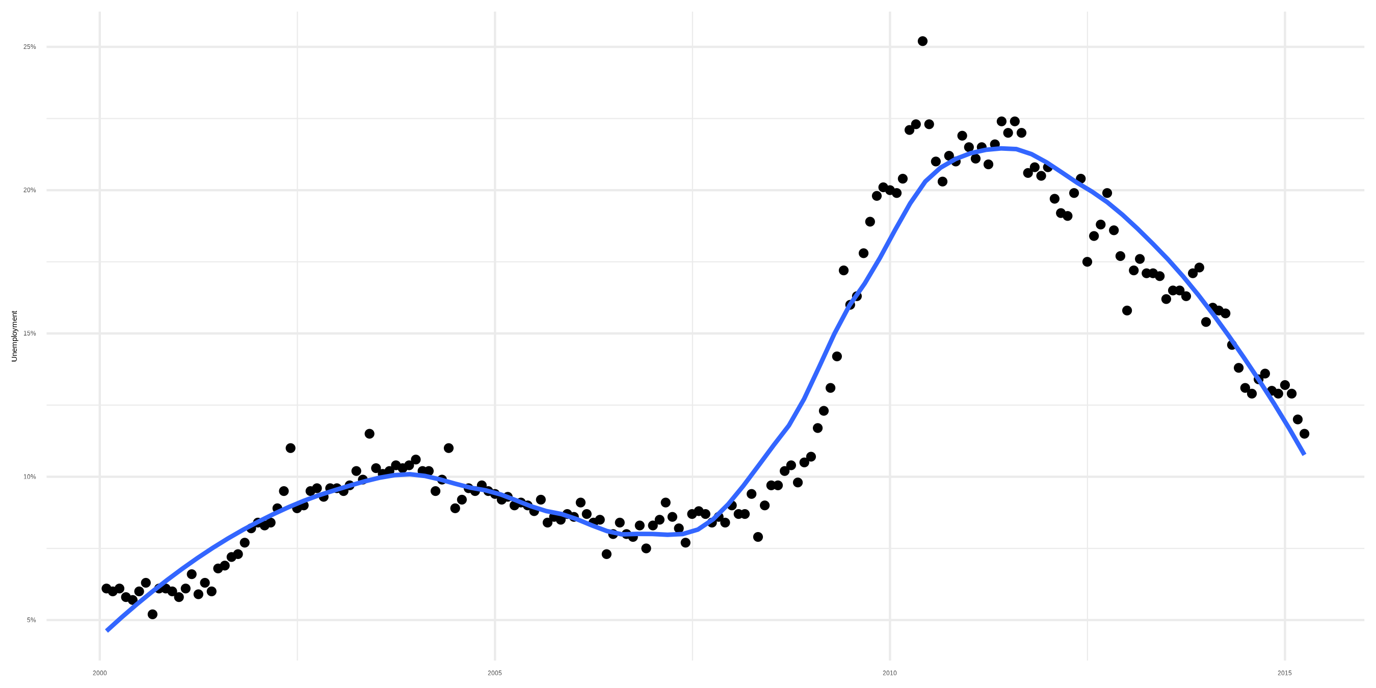
Smoother with loess fit