Code
library(tidyverse)This week there is less coding in the lectures because we’re thinking about graphs in a more general way. But the problem set wants you to practice some basic plotting, and ideally experiment a little as well. Here are some examples to get you started.
We begin as usual by loading the tidyverse package.
library(tidyverse)Remember, in R, everything has a name and everything is an object. You do things to named objects with functions (which are themselves objects!). And you create an object by assigning a thing to a name.
Assignment is the act of attaching a thing to a name. It is represented by <- or = and you can read it as “gets” or “is”. Type it by with the < and then the - key. Better, there is a shortcut: on Mac OS it is Option - or Option and the - (minus or hyphen) key together. On Windows it’s Alt -.
You do things with functions. Functions usually take input, perform actions, and then return output.
# Calculate the mean of my_numbers with the mean() function
my_numbers <- c(1,5,7,2,16,31,3,6,9)
mean(x = my_numbers)
[1] 8.888889The instructions you can give a function are its arguments. Here, x is saying “this is the thing I want you to take the mean of”.
If you provide arguments in the “right” order (the order the function expects), you don’t have to name them.
mean(my_numbers)[1] 8.888889To draw a graph in ggplot requires two kinds of statements: one saying what the data is and what relationship we want to plot, and the second saying what kind of plot we want. The first one is done by the ggplot() function.
ggplot(data = mpg,
       mapping = aes(x = displ, y = hwy))
You can see that by itself it doesn’t do anything.
But if we add a function saying what kind of plot, we get a result:
ggplot(data = mpg,
       mapping = aes(x = displ, y = hwy)) +
  geom_point()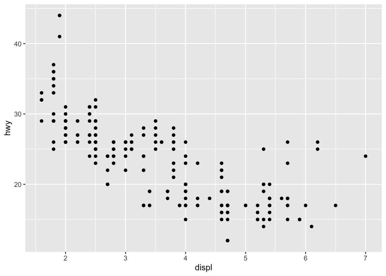
The data argument says which table of data to use. The mapping argument, which is done using the “aesthetic” function aes() tells ggplot which visual elements on the plot will represent which columns or variables in the data.
# The gapminder data
library(gapminder)
gapminder
# A tibble: 1,704 × 6
country continent year lifeExp pop gdpPercap
<fct> <fct> <int> <dbl> <int> <dbl>
1 Afghanistan Asia 1952 28.8 8425333 779.
2 Afghanistan Asia 1957 30.3 9240934 821.
3 Afghanistan Asia 1962 32.0 10267083 853.
4 Afghanistan Asia 1967 34.0 11537966 836.
5 Afghanistan Asia 1972 36.1 13079460 740.
6 Afghanistan Asia 1977 38.4 14880372 786.
7 Afghanistan Asia 1982 39.9 12881816 978.
8 Afghanistan Asia 1987 40.8 13867957 852.
9 Afghanistan Asia 1992 41.7 16317921 649.
10 Afghanistan Asia 1997 41.8 22227415 635.
# ℹ 1,694 more rowsA histogram is a summary of the distribution of a single variable:
ggplot(data = gapminder,
       mapping = aes(x = lifeExp)) +
  geom_histogram()
`stat_bin()` using `bins = 30`. Pick better value with `binwidth`.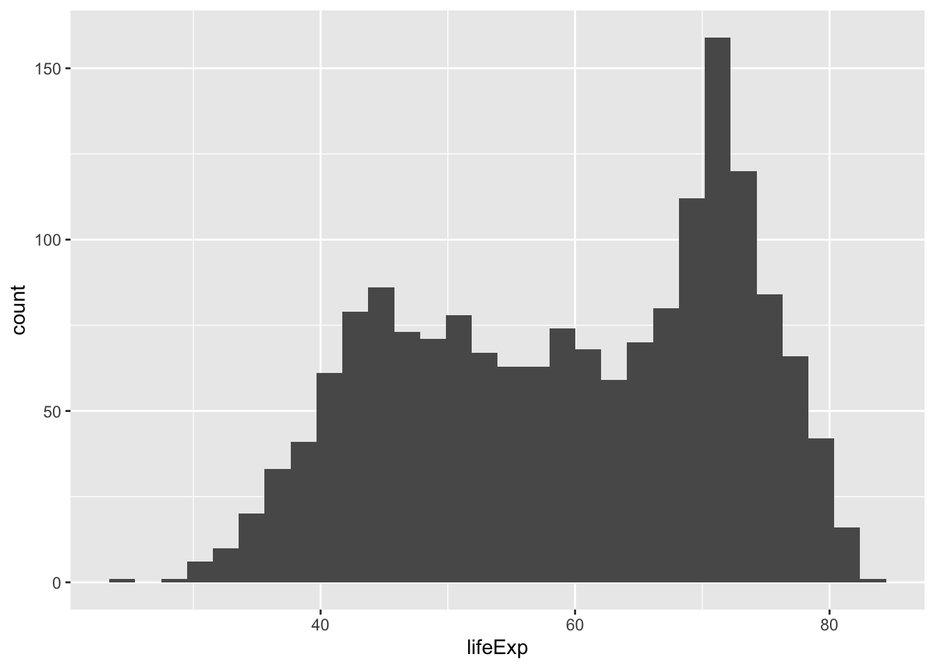
A scatterplot shows how two variables co-vary:
ggplot(data = gapminder,
       mapping = aes(x = gdpPercap, y = lifeExp)) +
geom_point() 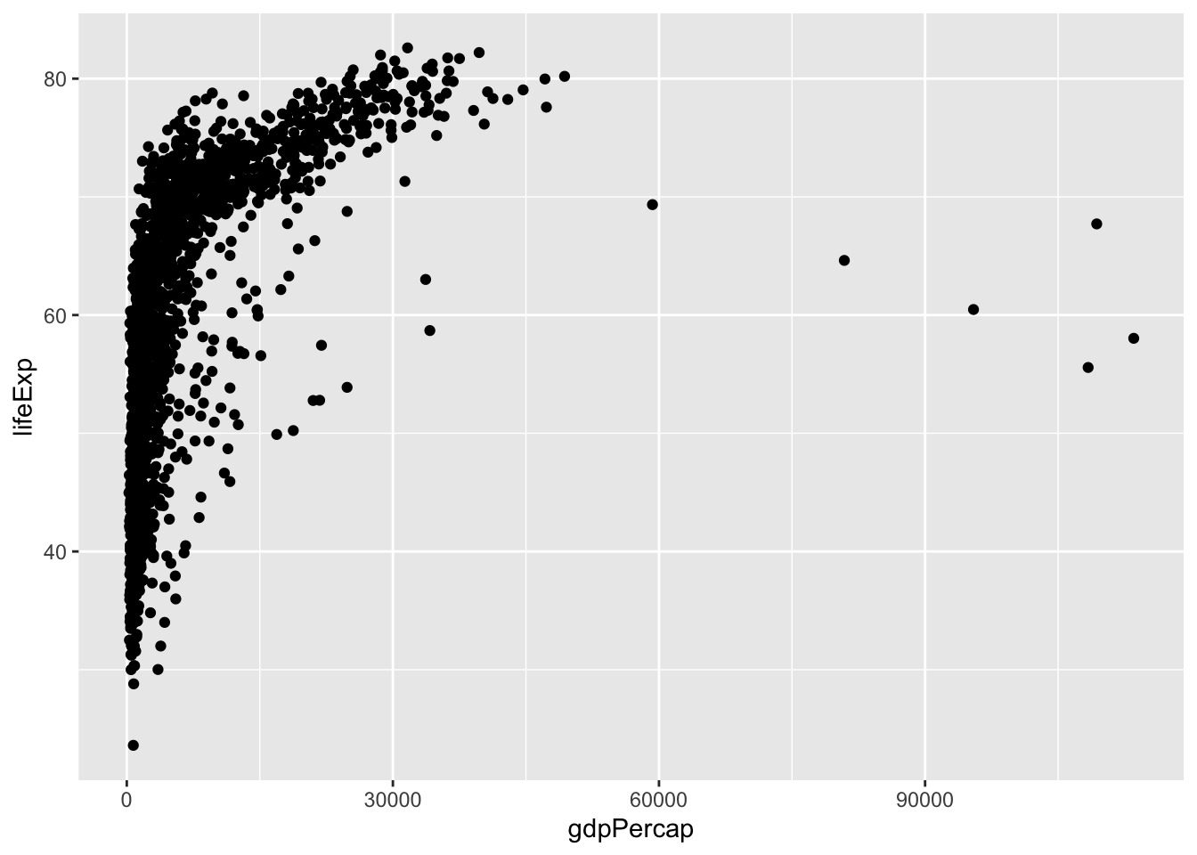
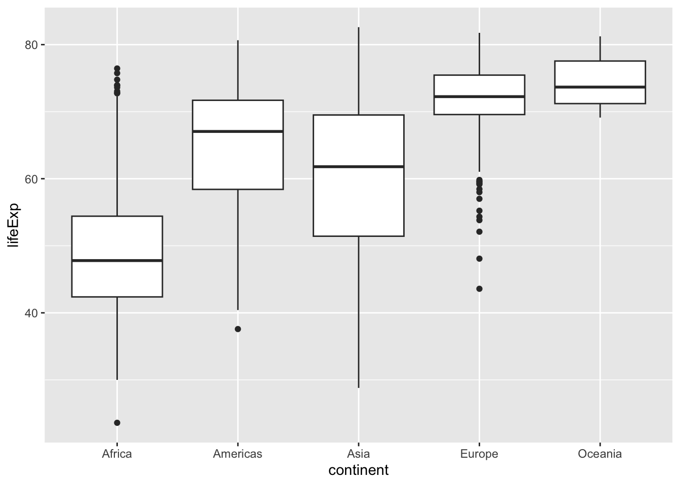
A boxplot is another way of showing the distribution of a single variable:
ggplot(data = gapminder,
       mapping = aes(y = lifeExp)) +
geom_boxplot() 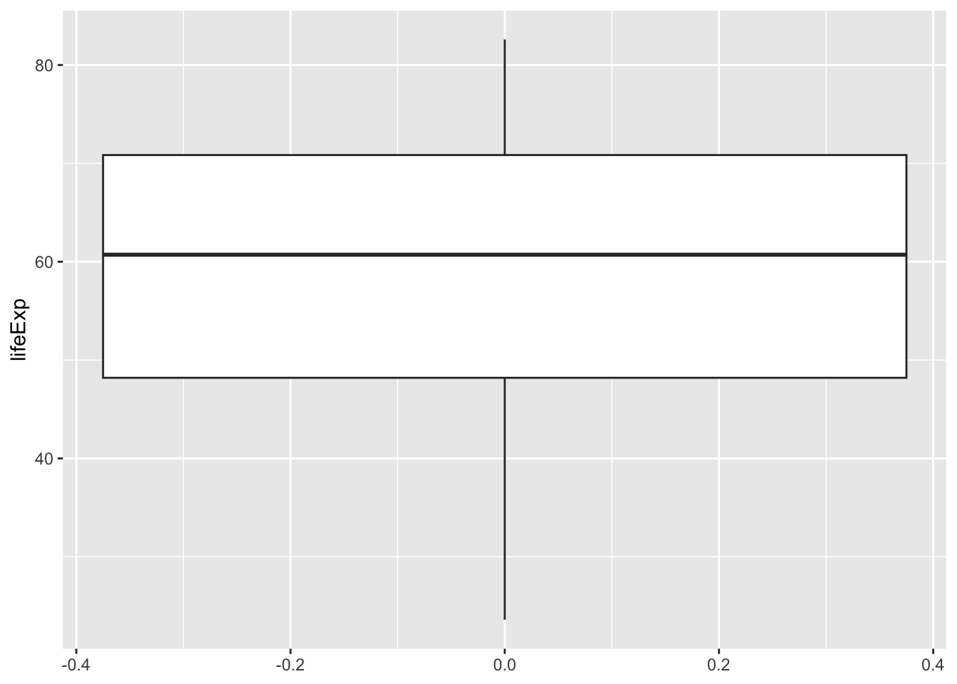
Boxplots are much more useful if we compare several of them:
ggplot(data = gapminder,
       mapping = aes(x = continent, y = lifeExp)) +
  geom_boxplot()