Code
library(tidyverse)
library(gapminder)
library(socviz)We make plots with the ggplot() function and some geom_ function. The former sets up the plot by specifying the data we are using and the relationships we want to see. The latter draws a specific kind of plot based on that information.
As always we load the packages we need. Here in addition to the tidyverse we load the gapminder data as a package.
library(tidyverse)
library(gapminder)
library(socviz)Are your data grouped?
gapminder |>
  ggplot(mapping = aes(x = year,
                       y = gdpPercap)) +
geom_line() 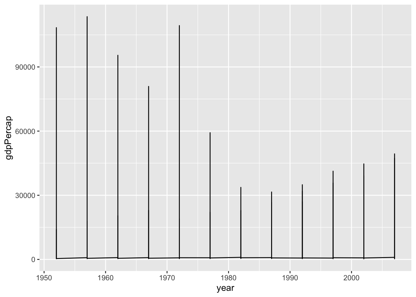
gapminder |>
  ggplot(mapping = aes(x = year,
                       y = gdpPercap)) +
geom_line(mapping = aes(group = country)) 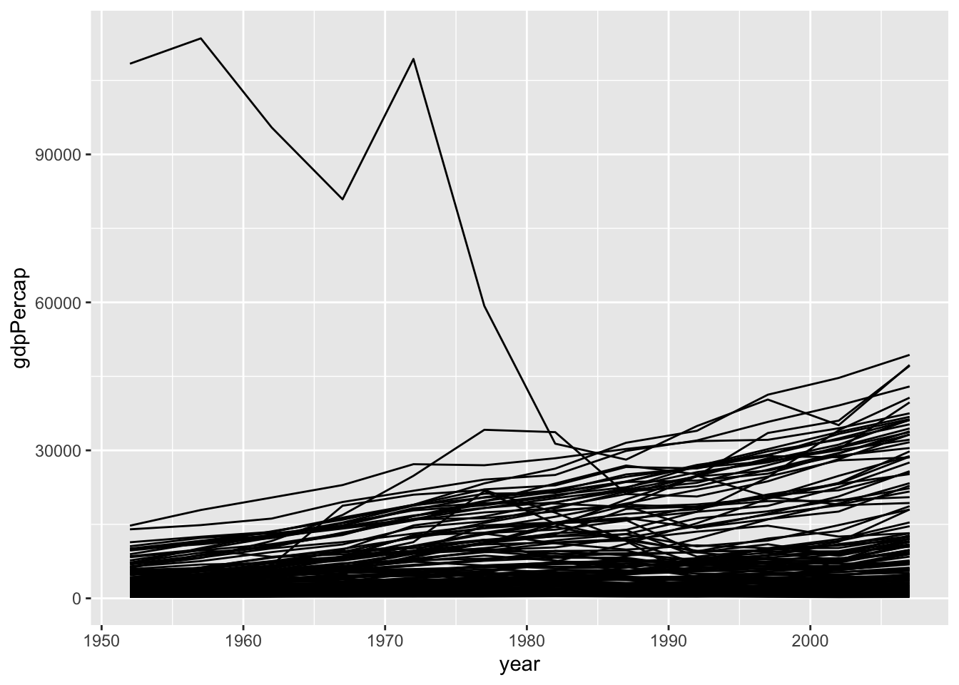
Facet to make small multiples:
gapminder |>
  ggplot(mapping =
           aes(x = year,
           y = gdpPercap)) +
  geom_line(mapping = aes(group = country)) +
  facet_wrap(~ continent)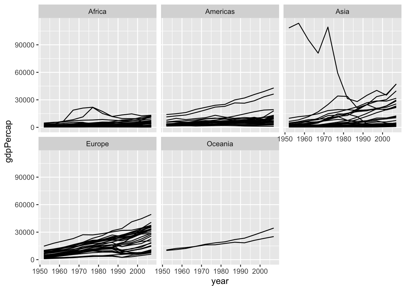
p <- ggplot(data = gapminder,
            mapping = aes(x = year,
                          y = gdpPercap))

p_out <- p + geom_line(color="gray70",
              mapping=aes(group = country)) +
    geom_smooth(linewidth = 1.1,
                method = "loess",
                se = FALSE) +
    scale_y_log10(labels=scales::label_dollar()) +
    facet_wrap(~ continent, ncol = 5) +
    labs(x = "Year",
         y = "log GDP per capita",
         title = "GDP per capita on Five Continents",
         subtitle = "1950-2007",
         caption = "Data: Gapminder")

p_out
`geom_smooth()` using formula = 'y ~ x'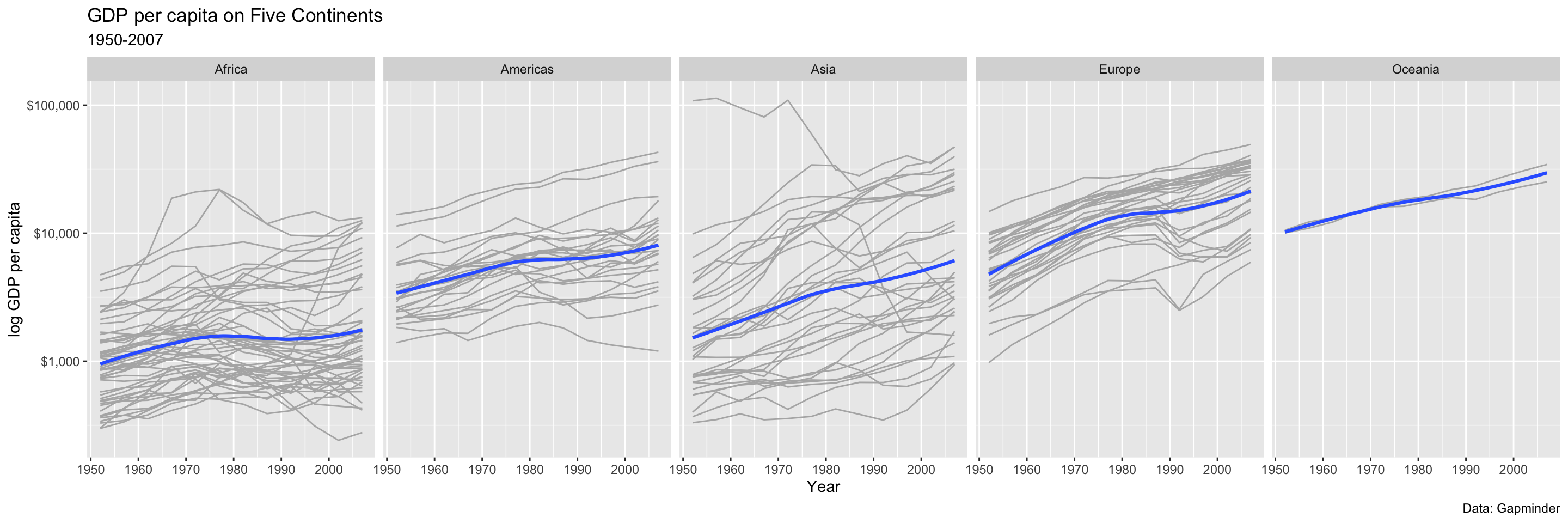
midwest# A tibble: 437 × 28
PID county state area poptotal popdensity popwhite popblack popamerindian
<int> <chr> <chr> <dbl> <int> <dbl> <int> <int> <int>
1 561 ADAMS IL 0.052 66090 1271. 63917 1702 98
2 562 ALEXAN… IL 0.014 10626 759 7054 3496 19
3 563 BOND IL 0.022 14991 681. 14477 429 35
4 564 BOONE IL 0.017 30806 1812. 29344 127 46
5 565 BROWN IL 0.018 5836 324. 5264 547 14
6 566 BUREAU IL 0.05 35688 714. 35157 50 65
7 567 CALHOUN IL 0.017 5322 313. 5298 1 8
8 568 CARROLL IL 0.027 16805 622. 16519 111 30
9 569 CASS IL 0.024 13437 560. 13384 16 8
10 570 CHAMPA… IL 0.058 173025 2983. 146506 16559 331
# ℹ 427 more rows
# ℹ 19 more variables: popasian <int>, popother <int>, percwhite <dbl>,
# percblack <dbl>, percamerindan <dbl>, percasian <dbl>, percother <dbl>,
# popadults <int>, perchsd <dbl>, percollege <dbl>, percprof <dbl>,
# poppovertyknown <int>, percpovertyknown <dbl>, percbelowpoverty <dbl>,
# percchildbelowpovert <dbl>, percadultpoverty <dbl>,
# percelderlypoverty <dbl>, inmetro <int>, category <chr>p <- ggplot(data = midwest,
mapping = aes(x = area))
p + geom_histogram()`stat_bin()` using `bins = 30`. Pick better value with `binwidth`.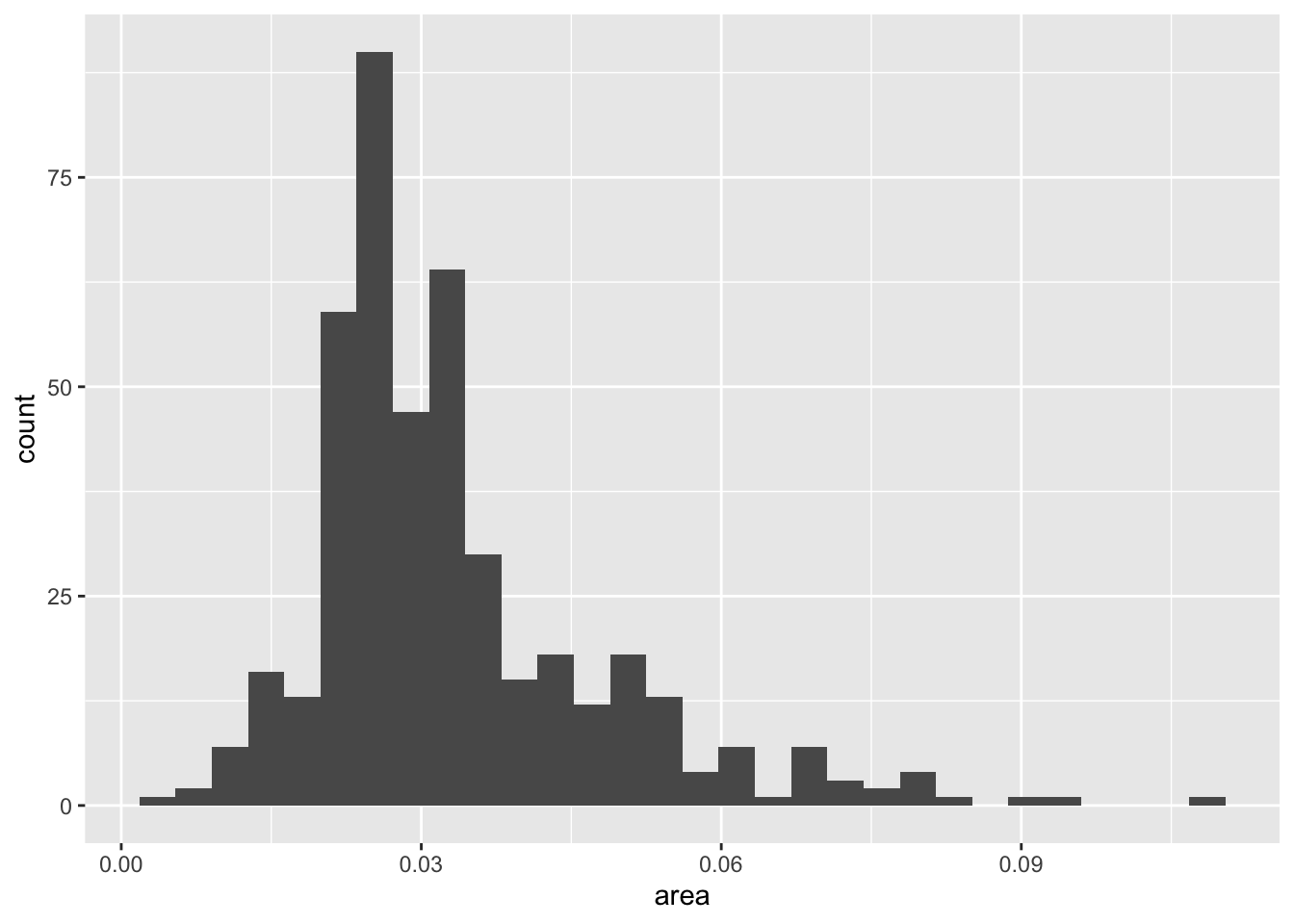
p <- ggplot(data = midwest,
            mapping = aes(x = area))

p + geom_histogram(bins = 10)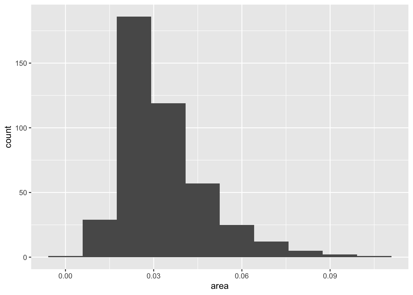
## Two state codes
oh_wi <- c("OH", "WI")

midwest |>
  filter(state %in% oh_wi) |>
  ggplot(mapping = aes(x = percollege,
                       fill = state)) +
  geom_histogram(alpha = 0.5,
                 position = "identity")
`stat_bin()` using `bins = 30`. Pick better value with `binwidth`.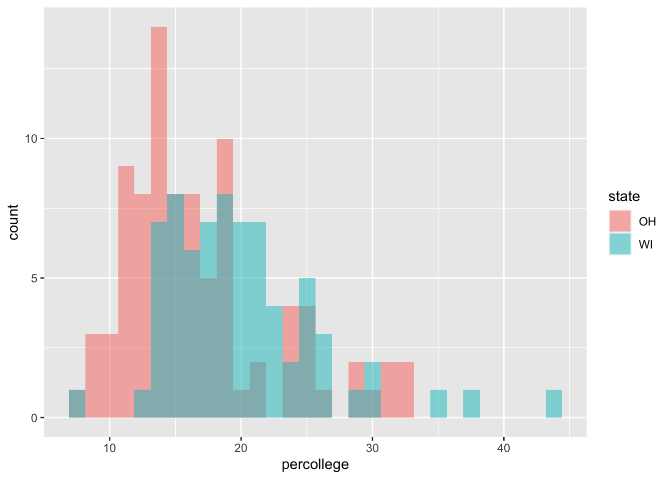
p <- ggplot(data = midwest,
            mapping = aes(x = area))

p + geom_density()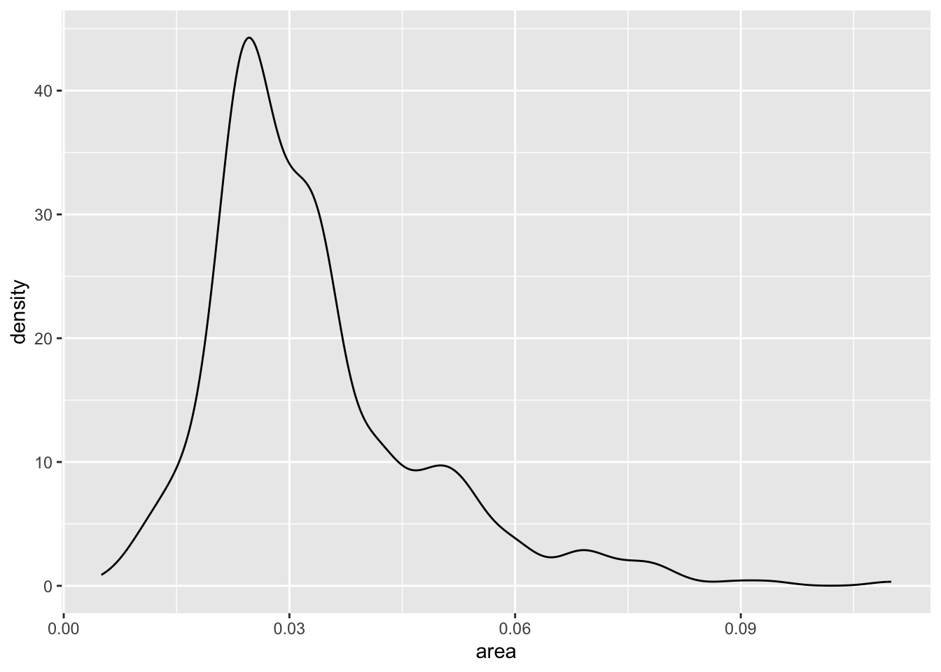
p <- ggplot(data = midwest,
            mapping = aes(x = area,
                          fill = state,
                          color = state))
p + geom_density(alpha = 0.3)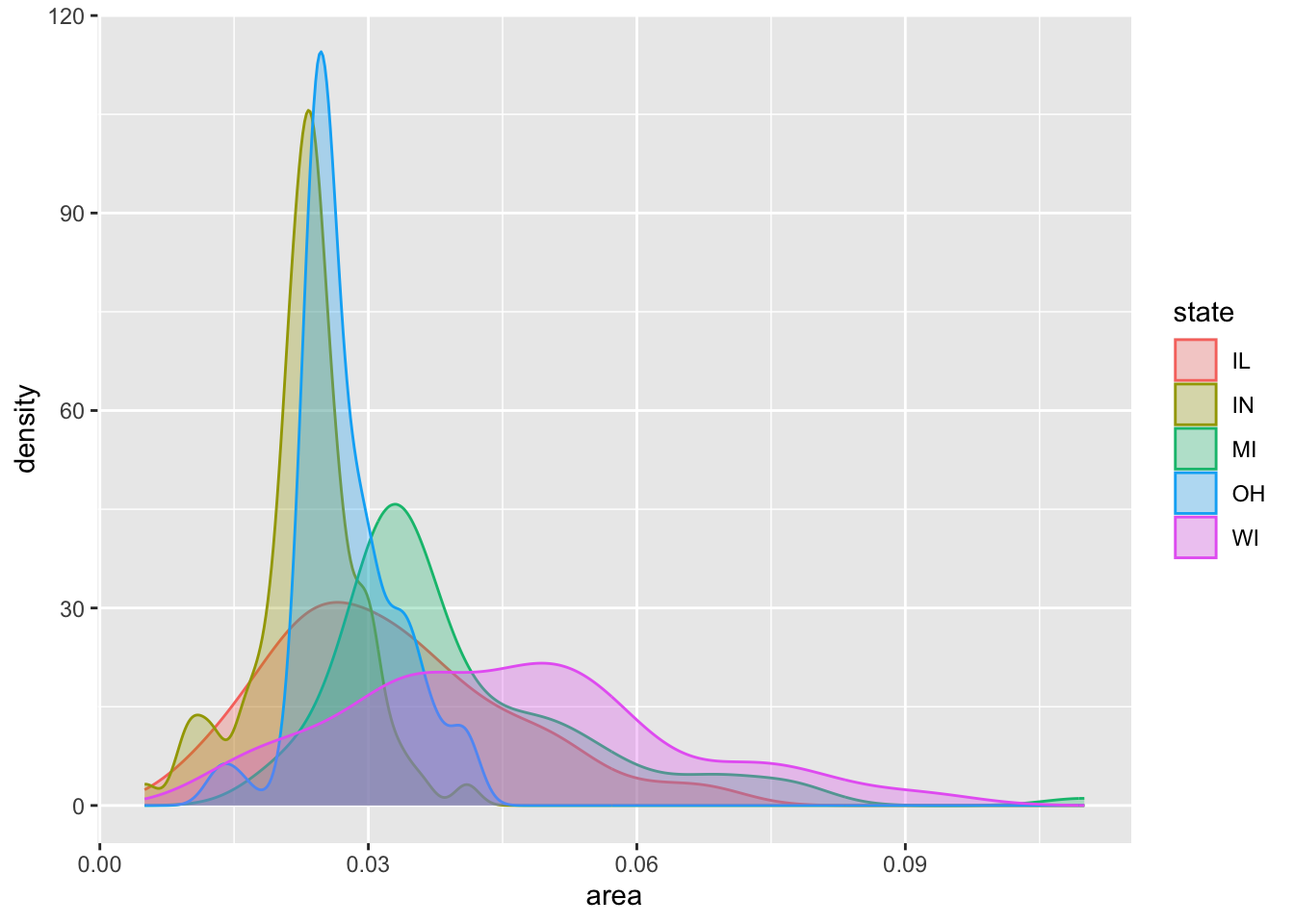
midwest |>
  filter(state %in% oh_wi) |>
  ggplot(mapping = aes(x = area,
                       fill = state,
                       color = state)) +
  geom_density(mapping = aes(y = after_stat(ndensity)),
               alpha = 0.4)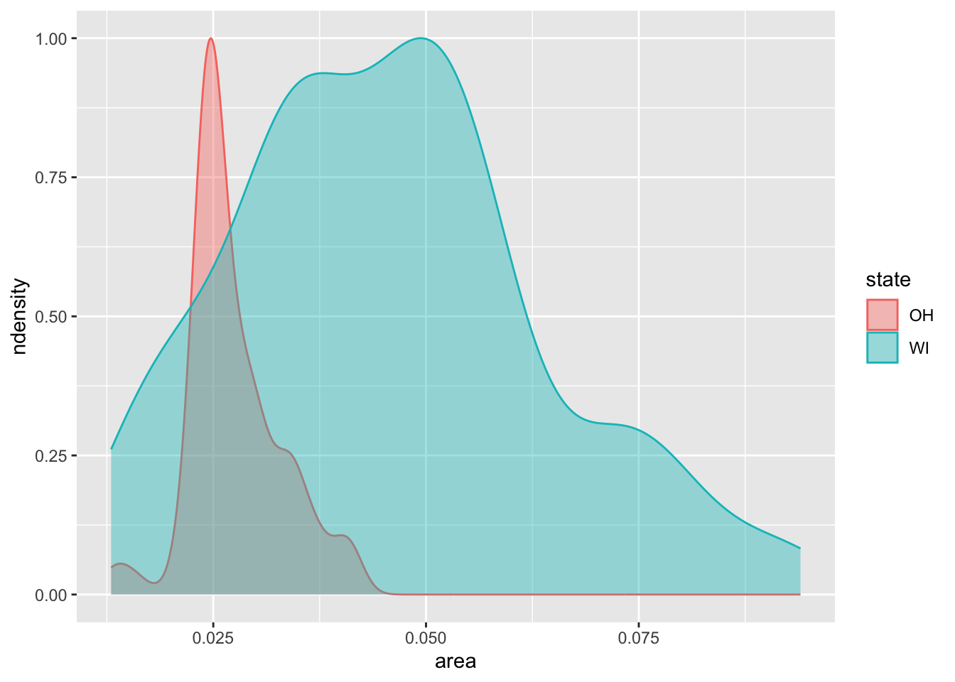
## Generate some fake data

## Keep track of labels for as_labeller() functions in plots later.
grp_names <- c(`a` = "Group A",
               `b` = "Group B",
               `c` = "Group C",
               `pop_a` = "Group A",
               `pop_b` = "Group B",
               `pop_c` = "Group C",
               `pop_total` = "Total",
               `A` = "Group A",
               `B` = "Group B",
               `C` = "Group C")


# make it reproducible
set.seed(1243098)

# 3,000 "counties"
N <- 3e3

## "County" populations
grp_ns <- c("size_a", "size_b", "size_c")
a_range <- c(1e5:5e5)
b_range <- c(3e5:7e5)
c_range <- c(4e5:5e5)

df_ns <- tibble(
  a_n = sample(a_range, N),
  b_n = sample(a_range, N),
  c_n = sample(a_range, N),
)


# Means and standard deviations of groups
mus <- c(0.2, 1, -0.1)
sds <- c(1.1, 0.9, 1)
grp <- c("pop_a", "pop_b", "pop_c")

# Make the parameters into a list
params <- list(mean = mus,
                sd = sds)

# Feed the parameters to rnorm() to make three columns,
# switch to rowwise() to take the weighted average of
## the columns for each row.
df_tmp <- pmap_dfc(params, rnorm, n = N) |>
  rename_with(~ grp) |>
  rowid_to_column("unit") |>
  bind_cols(df_ns) |>
  rowwise() |>
  mutate(pop_total = weighted.mean(c(pop_a, pop_b, pop_c),
                                   w = c(a_n, b_n, c_n))) |>
  ungroup() |>
  select(unit:pop_c, pop_total)

df_tmp
# A tibble: 3,000 × 5
unit pop_a pop_b pop_c pop_total
<int> <dbl> <dbl> <dbl> <dbl>
1 1 1.29 1.93 -0.0869 1.09
2 2 0.522 0.536 -0.762 0.190
3 3 2.14 1.47 -0.616 1.15
4 4 1.13 0.673 -0.242 0.575
5 5 1.04 1.30 1.18 1.12
6 6 1.80 0.140 2.05 1.33
7 7 0.186 1.30 -0.709 0.476
8 8 -0.953 0.520 -2.44 -0.767
9 9 0.700 1.66 -1.09 0.749
10 10 0.0416 0.484 -0.180 0.177
# ℹ 2,990 more rowsdf_tmp |>
pivot_longer(cols = pop_a:pop_total)# A tibble: 12,000 × 3
unit name value
<int> <chr> <dbl>
1 1 pop_a 1.29
2 1 pop_b 1.93
3 1 pop_c -0.0869
4 1 pop_total 1.09
5 2 pop_a 0.522
6 2 pop_b 0.536
7 2 pop_c -0.762
8 2 pop_total 0.190
9 3 pop_a 2.14
10 3 pop_b 1.47
# ℹ 11,990 more rowsdf_tmp |>
pivot_longer(cols = pop_a:pop_total) |>
ggplot() +
geom_histogram(mapping = aes(x = value,
y = after_stat(ncount),
color = name, fill = name),
stat = "bin", bins = 20,
linewidth = 0.5, alpha = 0.7,
position = "identity") +
labs(x = "Measure", y = "Scaled Count", color = "Group",
fill = "Group",
title = "Comparing Subgroups: Histograms")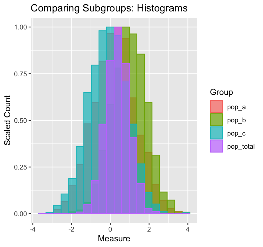
ncount is computed.# Just treat pop_a to pop_c as the single variable.
# Notice that pop_total just gets repeated.
df_tmp |>
pivot_longer(cols = pop_a:pop_c)# A tibble: 9,000 × 4
unit pop_total name value
<int> <dbl> <chr> <dbl>
1 1 1.09 pop_a 1.29
2 1 1.09 pop_b 1.93
3 1 1.09 pop_c -0.0869
4 2 0.190 pop_a 0.522
5 2 0.190 pop_b 0.536
6 2 0.190 pop_c -0.762
7 3 1.15 pop_a 2.14
8 3 1.15 pop_b 1.47
9 3 1.15 pop_c -0.616
10 4 0.575 pop_a 1.13
# ℹ 8,990 more rowsdf_tmp |>
pivot_longer(cols = pop_a:pop_c) |>
ggplot() +
geom_histogram(mapping = aes(x = pop_total,
y = after_stat(ncount)),
bins = 20, alpha = 0.7,
fill = "gray40", linewidth = 0.5) +
geom_histogram(mapping = aes(x = value,
y = after_stat(ncount),
color = name, fill = name),
stat = "bin", bins = 20, linewidth = 0.5,
alpha = 0.5) +
guides(color = "none", fill = "none") +
labs(x = "Measure", y = "Scaled Count",
title = "Comparing Subgroups: Histograms",
subtitle = "Reference distribution shown in gray") +
facet_wrap(~ name, nrow = 1) 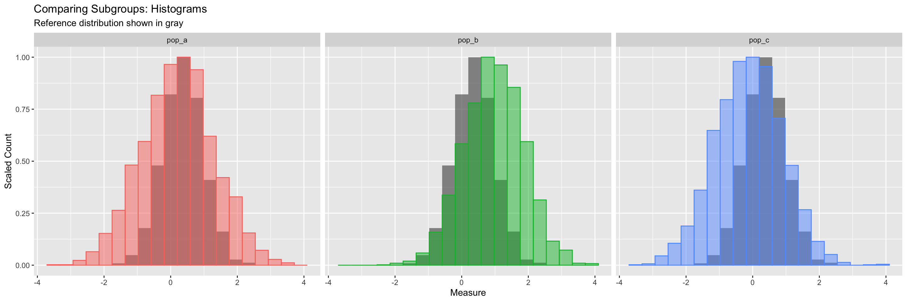
Remember, we can layer geoms one on top of the other. Here we call geom_histogram() twice. What happens if you comment one or other of them out?
The call to guides() turns off the legend for the color and fill, because we don’t need them.