── Conflicts ────────────────────────────────────────── tidyverse_conflicts() ──
✖ dplyr::filter() masks stats::filter()
✖ dplyr::lag()    masks stats::lag()
ℹ Use the conflicted package (<http://conflicted.r-lib.org/>) to force all conflicts to become errors
Code
library(tsibble) # time series and forecasting tools
Attaching package: 'tsibble'

The following object is masked from 'package:lubridate':

    interval

The following objects are masked from 'package:base':

    intersect, setdiff, union
Code
library(feasts)
Loading required package: fabletools
Code
library(fable)library(seasonal)
Attaching package: 'seasonal'

The following object is masked from 'package:tibble':

    view
Data
Here’s an example that goes beyond what’s in class. We have hourly data on electricity generation and demand for Duke Energy for the whole of 2019:
Code
power <-read_csv(here::here("files", "data", "duke_power.csv"))
Rows: 8760 Columns: 7
── Column specification ────────────────────────────────────────────────────────
Delimiter: ","
dbl  (4): hour_number, demand_forecast_mw, demand_mw, net_generation_mw
dttm (2): local_time_at_end_of_hour, utc_time_at_end_of_hour
date (1): date

ℹ Use `spec()` to retrieve the full column specification for this data.
ℹ Specify the column types or set `show_col_types = FALSE` to quiet this message.
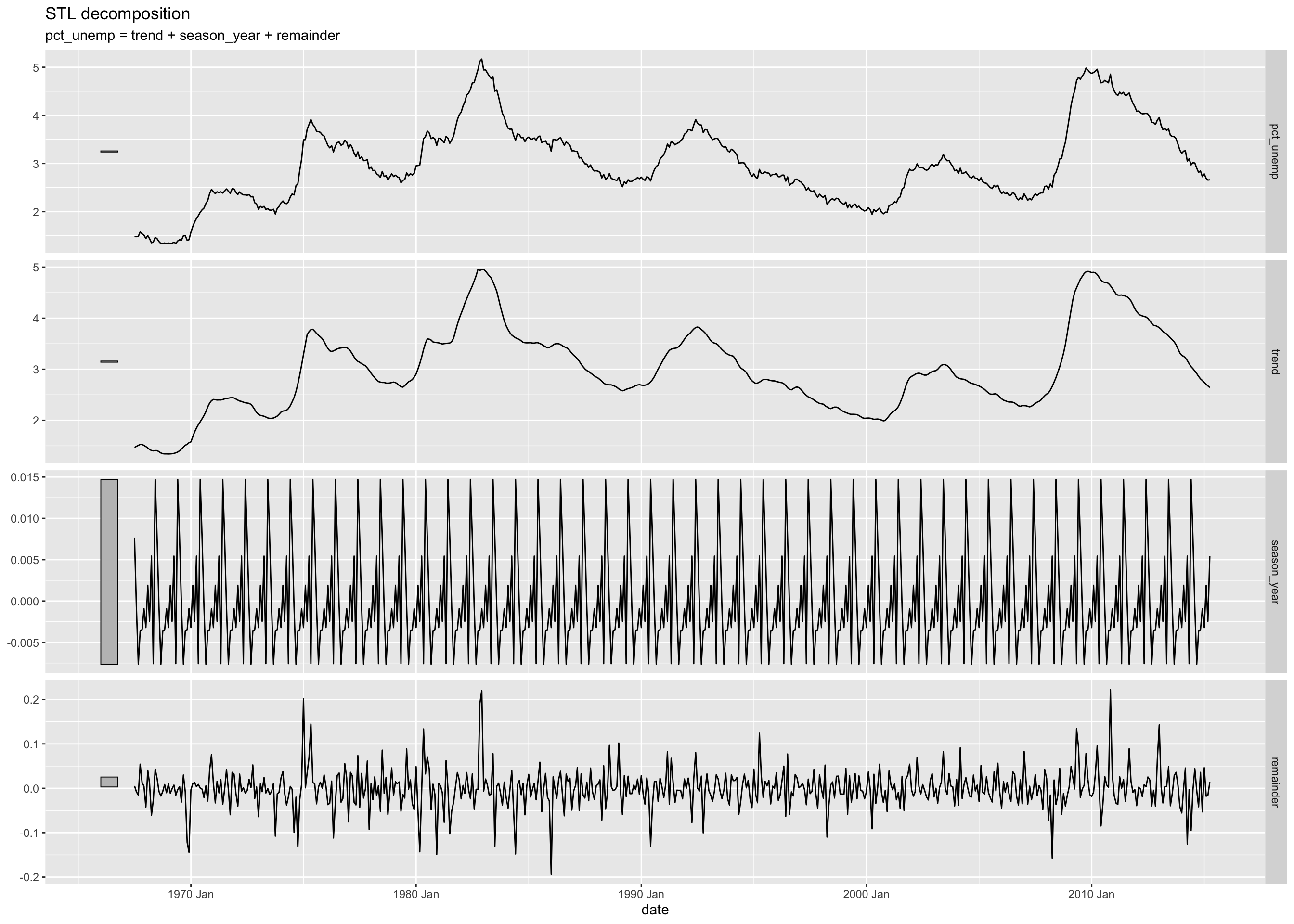
Read the help for feasts::STL to learn more about the window argument.
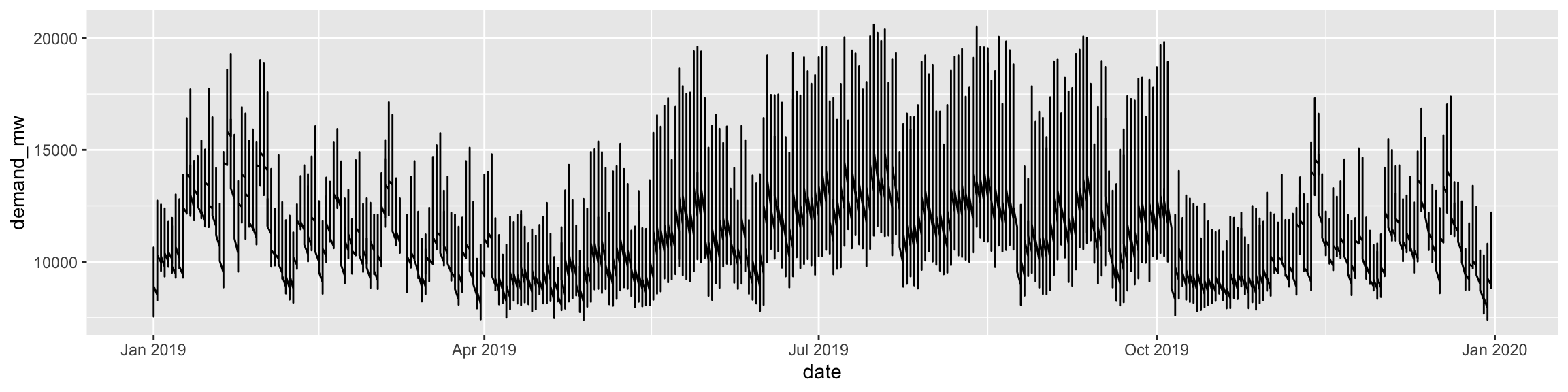
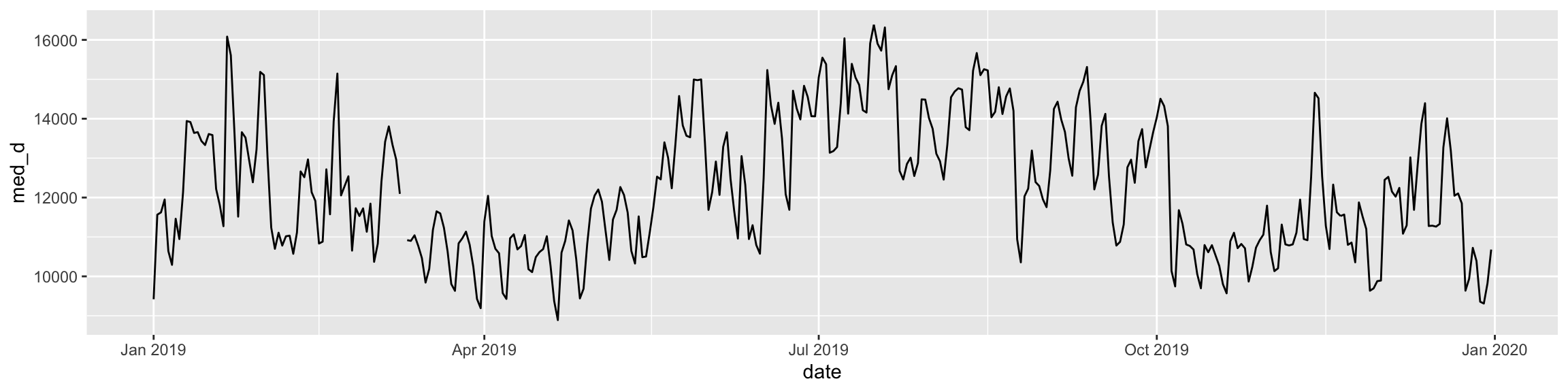
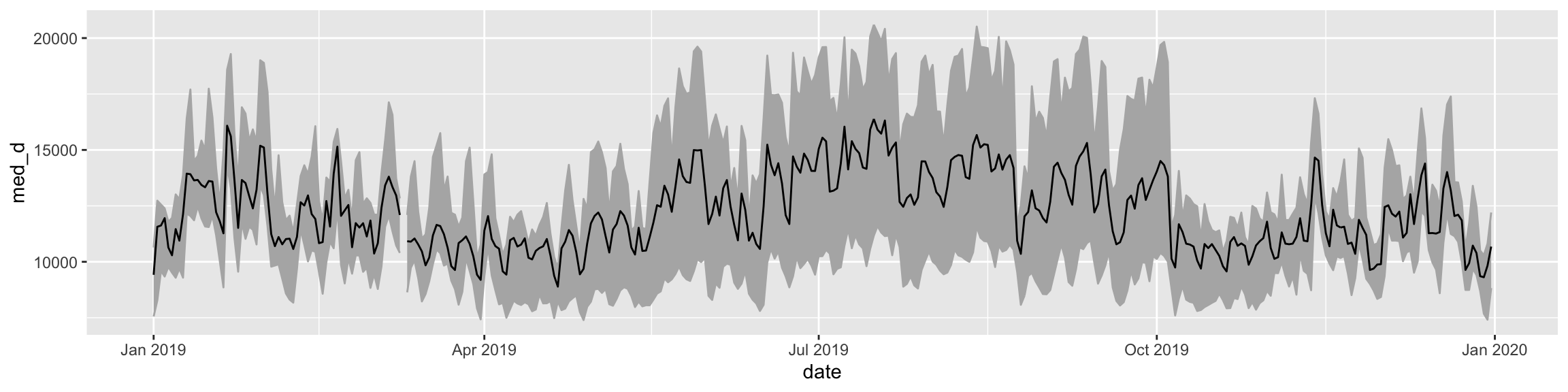
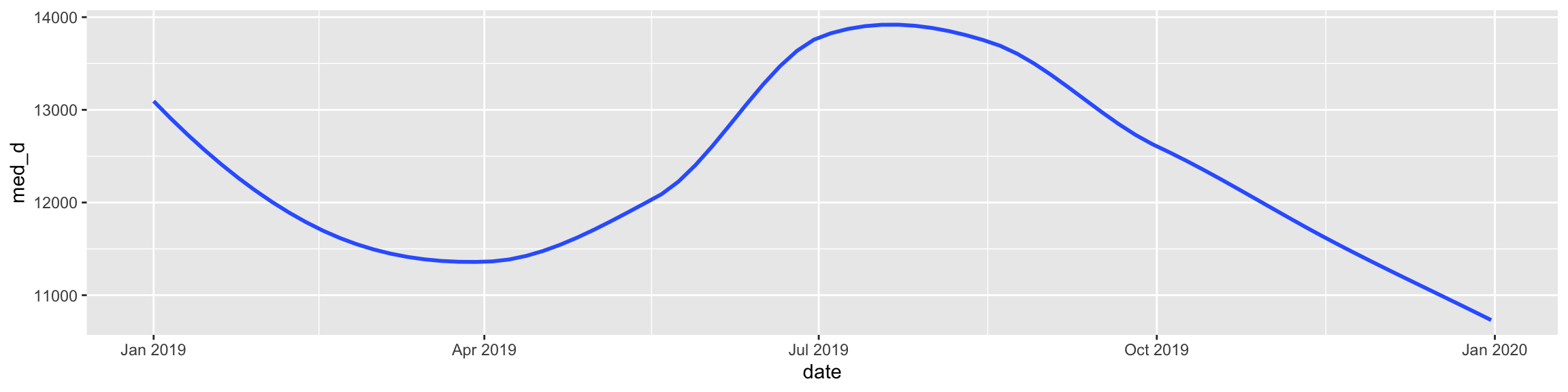
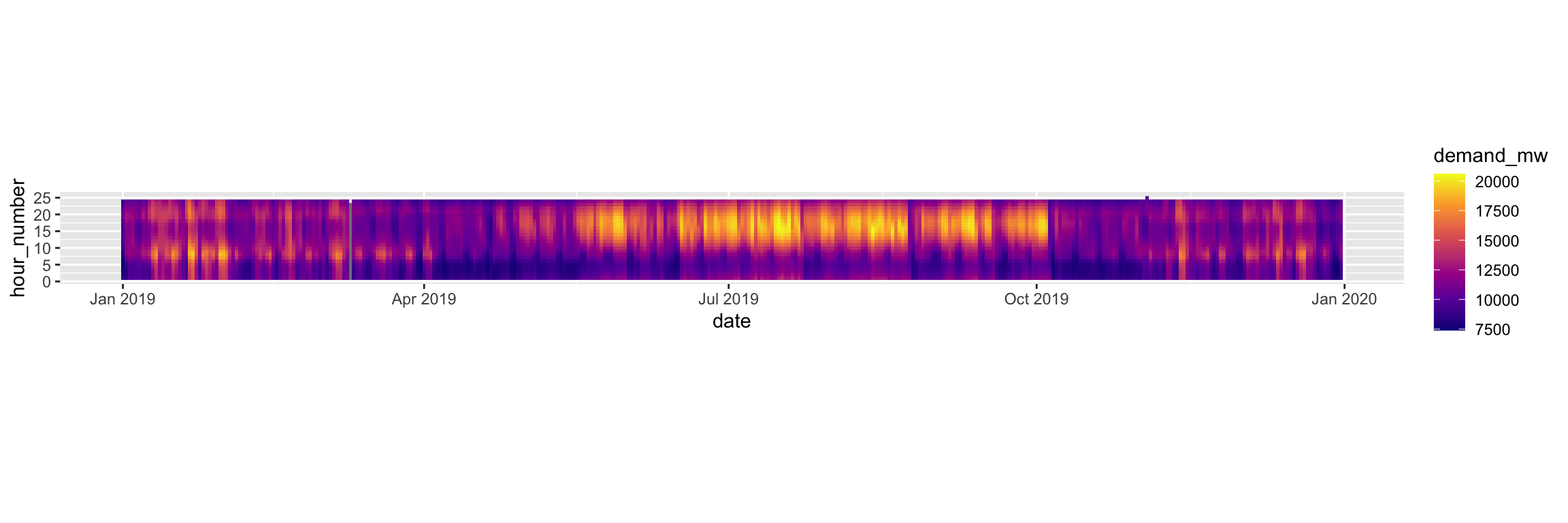
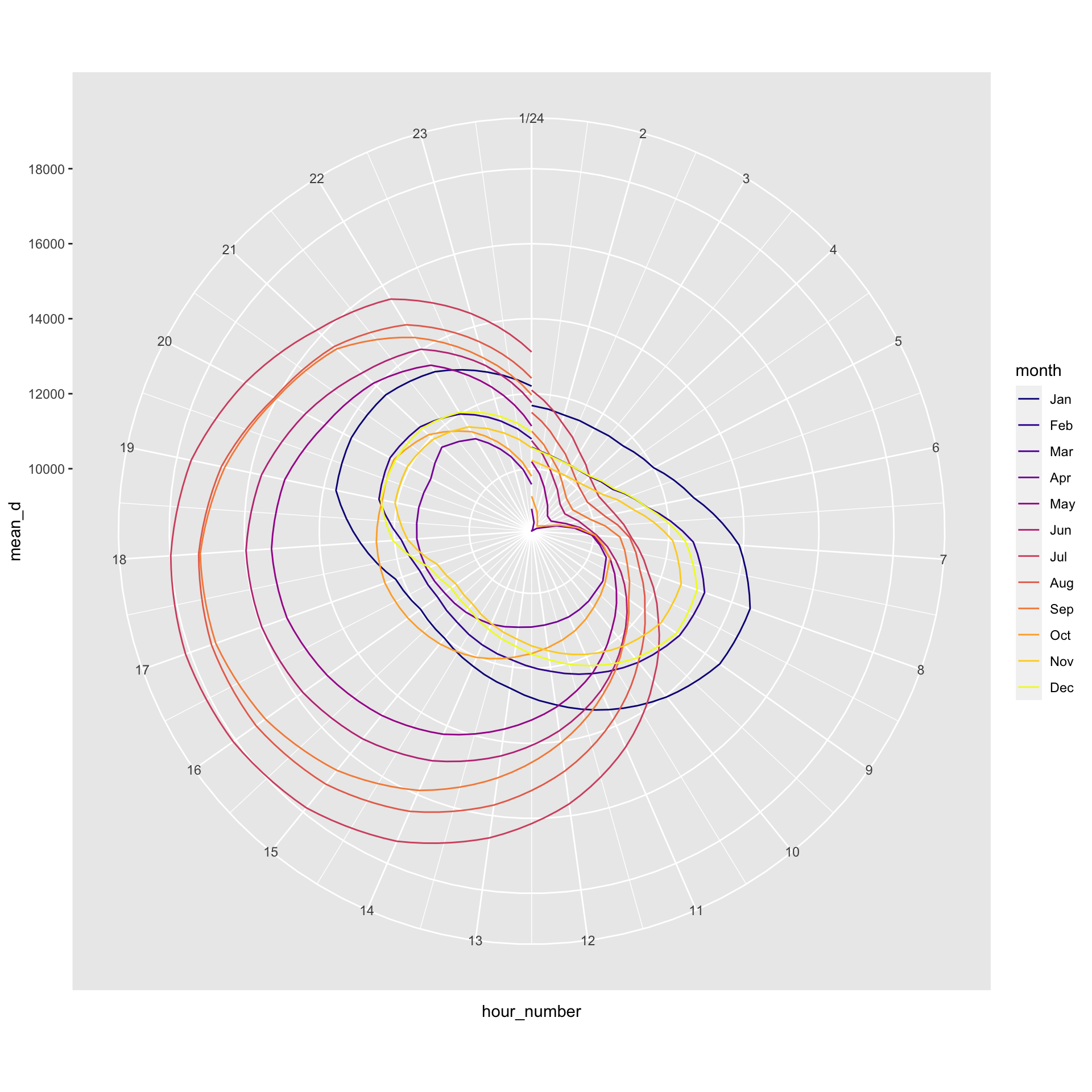
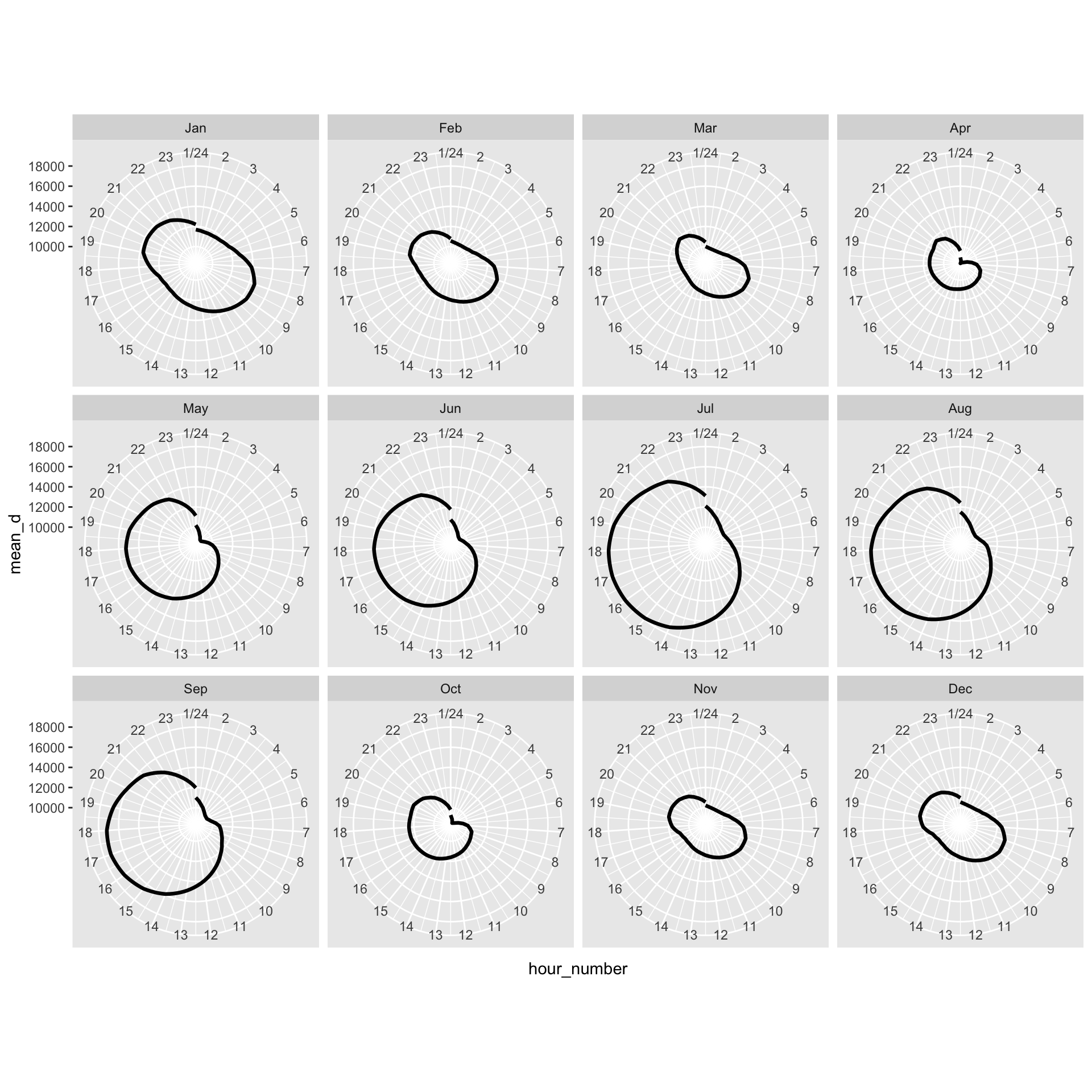
Source Code
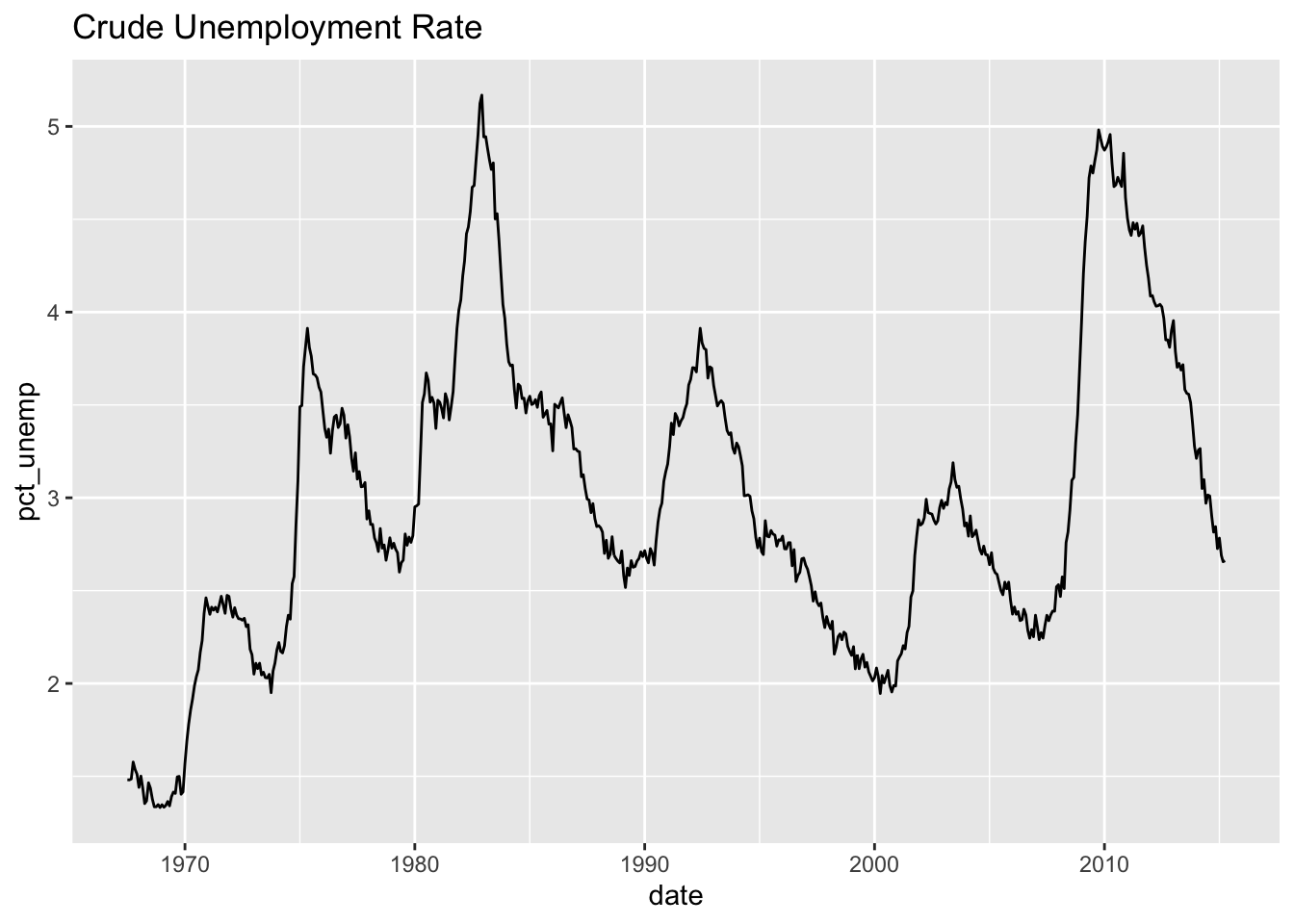
---title: "Example 08: Time Series"---## Setup```{r}library(here) # manage file pathslibrary(socviz) # data and some useful functionslibrary(tidyverse) # your friend and minelibrary(tsibble) # time series and forecasting toolslibrary(feasts)library(fable)library(seasonal)```## DataHere's an example that goes beyond what's in class. We have hourly data on electricity generation and demand for Duke Energy for the whole of 2019:```{r}power <-read_csv(here::here("files", "data", "duke_power.csv")) power ```## Raw dataIf we graph this, the hourly character of the data makes it very hard to see what's happening if we use a line graph.```{r, fig.width=12, fig.height=3}power |> ggplot(mapping = aes(x = date, y = demand_mw)) + geom_line()```## Daily median demand over the yearOne option might be to aggregate into a daily median figure:```{r, fig.width=12, fig.height=3}power |> group_by(date) |> summarize(med_d = median(demand_mw)) |> ggplot(mapping = aes(x = date, y = med_d)) + geom_line()```You can see one day of data is missing, on March 10th.## Daily median/min/max over the yearWe could calculate more daily summaries. E.g., let's use `geom_ribbon()` to add min and max bounds. ```{r, fig.width=12, fig.height=3}power |> group_by(date) |> summarize(med_d = median(demand_mw), min_d = min(demand_mw), max_d = max(demand_mw) ) |> ggplot() + geom_ribbon(mapping = aes(x = date, ymin = min_d, ymax = max_d), color = "gray70", fill = "gray70") + geom_line(mapping = aes(x = date, y = med_d))```## Smoothed too muchAn ordinary smoother will tend to aggregate away a lot of information, though perhaps it's still informative?```{r, fig.width=12, fig.height=3}power |> group_by(date) |> summarize(med_d = median(demand_mw), min_d = min(demand_mw), max_d = max(demand_mw) ) |> ggplot() + geom_smooth(mapping = aes(x = date, y = med_d), se = FALSE)```## Alternative ways to keep the hourly resolution?We could use a tile or raster layout:```{r, fig.height=4, fig.width=12}power |> ggplot(mapping = aes(x = date, y = hour_number, fill = demand_mw)) + geom_tile() + coord_fixed() + scale_fill_viridis_c(option = "C")```We could try a line graph with polar coordinates:```{r, fig.height=10, fig.width=10}power |> # There's one DST hour filter(hour_number %nin% c(25)) |> mutate(month = lubridate::month(date, label = TRUE, abbr = TRUE)) |> group_by(month, hour_number) |> summarize(mean_d = mean(demand_mw)) |> ggplot(mapping = aes(x = hour_number, y = mean_d, group = month)) + geom_line(mapping = aes(color = month)) + coord_polar() + scale_color_viridis_d(option = "C") + scale_x_continuous(breaks = c(1:24), labels = c(1:24))```Or facet that instead?```{r, fig.height=10, fig.width=10}power |> # There's one DST hour filter(hour_number %nin% c(25)) |> mutate(month = lubridate::month(date, label = TRUE, abbr = TRUE)) |> group_by(month, hour_number) |> summarize(mean_d = mean(demand_mw, na.rm = TRUE)) |> ggplot(mapping = aes(x = hour_number, y = mean_d)) + geom_line(linewidth = rel(1.15)) + coord_polar() + scale_x_continuous(breaks = c(1:24), labels = c(1:24)) + facet_wrap(~ month)```## A DecompositionSome new data:```{r}economics``````{r}## This data is included with the tidyverseeconomicseconomics <- economics |>mutate(pct_unemp = (unemploy/pop) *100)economics |>ggplot(mapping =aes(x = date, y = pct_unemp)) +geom_line() +labs(title ="Crude Unemployment Rate")```Let's use an STL decomposition. The data are monthly. We convert it to a "tsibble", which is what the decomposition function likes.```{r, fig.height=10, fig.width=14}economics |> as_tsibble() |> mutate(date = yearmonth(date)) |> model( STL(pct_unemp ~ trend(window = 7) + season(window = "periodic"), robust = TRUE)) |> components() |> autoplot()```Read the help for `feasts::STL` to learn more about the `window` argument.