── Conflicts ────────────────────────────────────────── tidyverse_conflicts() ──
✖ dplyr::filter() masks stats::filter()
✖ dplyr::lag()    masks stats::lag()
ℹ Use the conflicted package (<http://conflicted.r-lib.org/>) to force all conflicts to become errors
Code
library(tidygraph) # tidy management of relational data
Attaching package: 'tidygraph'

The following object is masked from 'package:stats':

    filter
Code
library(ggraph) # geoms for drawing graphs#remotes::install_github("kjhealy/kjhnet")library(kjhnet) # some network datasets
Sometimes, we have data that doesn’t look particularly relational at first glance, but we can make it so.
Code
set_graph_style(family ="Myriad Pro SemiCondensed")library(ggraph)library(tidygraph)set_graph_style(family ="Myriad Pro SemiCondensed")
Warren’s socjobs data
Code
socjobs
# A tibble: 343 × 7
   sex   job_yr job_dept   phd_yr phd_dept  top25phd   gap
   <chr>  <dbl> <chr>       <dbl> <chr>     <chr>    <dbl>
 1 F       2017 NYU          2017 Duke      Yes          0
 2 F       2017 Columbia     2016 Princeton Yes          1
 3 F       2008 Minnesota    2006 Sussex    No           2
 4 M       2013 Arizona      2012 UCSF      No           1
 5 M       2015 Penn State   2012 Arizona   Yes          3
 6 M       1997 Indiana      1997 UNC       Yes          0
 7 F       1991 Harvard      1990 Stanford  Yes          1
 8 F       2010 Yale         2008 UCLA      Yes          2
 9 M       2013 Minnesota    2013 Irvine    No           0
10 M       2013 Cornell      2011 Wisconsin Yes          2
# ℹ 333 more rows
Let’s clean it up a little:
Code
clean_dept_names <-function(x) { x <-str_replace(x, "California-", "") x <-str_replace(x, "SUNY-", "") x <-str_replace(x, "SUNY-", "") x <-str_replace(x, "Illinois-Chicago", "UIC") x <-str_replace(x, "U of Illinois", "UIUC") x <-str_replace(x, "U of Pennsylvania", "U Penn") x <-str_replace(x, "San Francisco", "UCSF") x <-str_replace(x, "North Carolina", "UNC") x <-str_replace(x, "N.C. State", "NC State") x}jobnet <- socjobs |># Texas isn't in the data properlyfilter(top25phd =="Yes", phd_dept !="Texas", job_dept !="Texas") |>select(phd_dept, job_dept) |>mutate(phd_dept =clean_dept_names(phd_dept),job_dept =clean_dept_names(job_dept)) |>group_by(phd_dept, job_dept) |>tally()
At this point we have tallied jobs by PhD department and First Job Department:
Code
jobnet
# A tibble: 182 × 3
# Groups:   phd_dept [22]
   phd_dept job_dept         n
   <chr>    <chr>        <int>
 1 Arizona  Cornell          2
 2 Arizona  Duke             1
 3 Arizona  Indiana          1
 4 Arizona  Northwestern     1
 5 Arizona  Ohio State       2
 6 Arizona  Penn State       1
 7 Arizona  Stanford         1
 8 Berkeley Arizona          3
 9 Berkeley Chicago          2
10 Berkeley Columbia         3
# ℹ 172 more rows
Next we rename n to weight and make a scaled weight (in case we need it), and convert it to a network format:
Code
jobnet <- jobnet |>select(from = phd_dept, to = job_dept, weight = n) |>mutate(scale_weight =scale(weight, center =FALSE)) |>filter(weight >0) |>as_tbl_graph() jobnet
# A tbl_graph: 22 nodes and 182 edges
#
# A directed multigraph with 1 component
#
# Node Data: 22 × 1 (active)
   name
   <chr>
 1 Arizona
 2 Berkeley
 3 Chicago
 4 Columbia
 5 Cornell
 6 Duke
 7 Harvard
 8 Indiana
 9 Michigan
10 Minnesota
# ℹ 12 more rows
#
# Edge Data: 182 × 4
   from    to weight scale_weight
  <int> <int>  <int>        <dbl>
1     1     5      2        1.36
2     1     6      1        0.679
3     1     8      1        0.679
# ℹ 179 more rows
Now we can calculate centrality scores and draw a graph:
Code
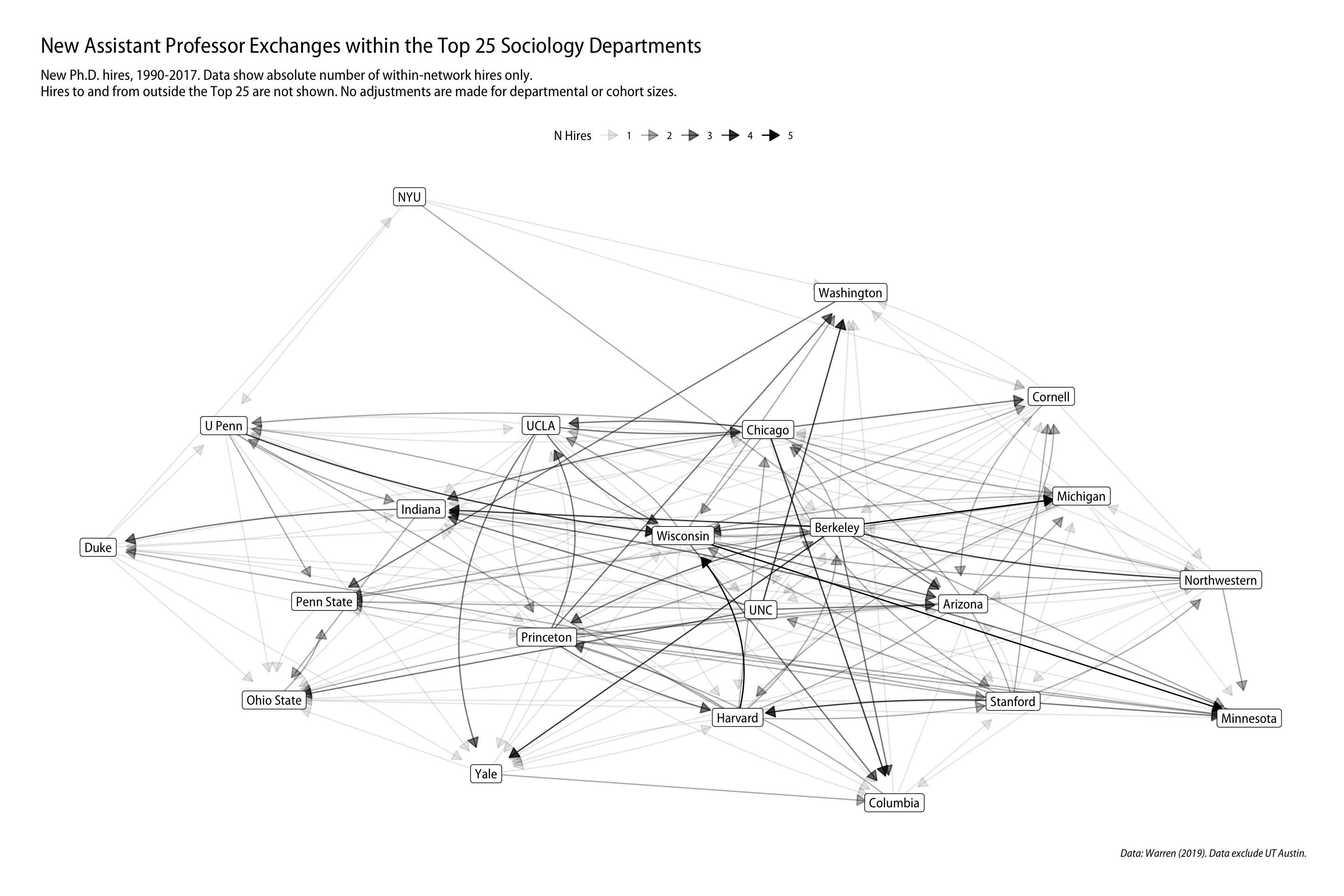
jobnet |>mutate(centrality =centrality_eigen(weights = weight)) |>ggraph(layout ="graphopt") +geom_edge_fan(aes(alpha = weight),arrow =arrow(length =unit(3, "mm"), type ="closed"), start_cap =circle(2, "mm"),end_cap =circle(8, "mm")) +geom_node_label(aes(label = name)) +scale_edge_alpha_continuous(name ="N Hires") +labs(title ="New Assistant Professor Exchanges within the Top 25 Sociology Departments", subtitle ="New Ph.D. hires, 1990-2017. Data show absolute number of within-network hires only.\nHires to and from outside the Top 25 are not shown. No adjustments are made for departmental or cohort sizes.", caption ="Data: Warren (2019). Data exclude UT Austin.") +theme_graph(base_family ="Myriad Pro SemiCondensed") +theme(legend.position ="top")
Warning: Using the `size` aesthetic in this geom was deprecated in ggplot2 3.4.0.
ℹ Please use `linewidth` in the `default_aes` field and elsewhere instead.
Source Code
---title: "Example 12: Network Data"---## Setup```{r}library(here) # manage file pathslibrary(socviz) # data and some useful functionslibrary(tidyverse) # your friend and minelibrary(tidygraph) # tidy management of relational datalibrary(ggraph) # geoms for drawing graphs#remotes::install_github("kjhealy/kjhnet")library(kjhnet) # some network datasets```Sometimes, we have data that doesn't _look_ particularly relational at first glance, but we can make it so. ```{r}set_graph_style(family ="Myriad Pro SemiCondensed")library(ggraph)library(tidygraph)set_graph_style(family ="Myriad Pro SemiCondensed")```## Warren's socjobs data```{r}socjobs```Let's clean it up a little:```{r}clean_dept_names <-function(x) { x <-str_replace(x, "California-", "") x <-str_replace(x, "SUNY-", "") x <-str_replace(x, "SUNY-", "") x <-str_replace(x, "Illinois-Chicago", "UIC") x <-str_replace(x, "U of Illinois", "UIUC") x <-str_replace(x, "U of Pennsylvania", "U Penn") x <-str_replace(x, "San Francisco", "UCSF") x <-str_replace(x, "North Carolina", "UNC") x <-str_replace(x, "N.C. State", "NC State") x}jobnet <- socjobs |># Texas isn't in the data properlyfilter(top25phd =="Yes", phd_dept !="Texas", job_dept !="Texas") |>select(phd_dept, job_dept) |>mutate(phd_dept =clean_dept_names(phd_dept),job_dept =clean_dept_names(job_dept)) |>group_by(phd_dept, job_dept) |>tally() ```At this point we have tallied jobs by PhD department and First Job Department:```{r}jobnet```Next we rename `n` to `weight` and make a scaled weight (in case we need it), and convert it to a network format:```{r}jobnet <- jobnet |>select(from = phd_dept, to = job_dept, weight = n) |>mutate(scale_weight =scale(weight, center =FALSE)) |>filter(weight >0) |>as_tbl_graph() jobnet```Now we can calculate centrality scores and draw a graph:```{r, fig.height=10, fig.width=15}jobnet |> mutate(centrality = centrality_eigen(weights = weight)) |> ggraph(layout = "graphopt") + geom_edge_fan(aes(alpha = weight), arrow = arrow(length = unit(3, "mm"), type = "closed"), start_cap = circle(2, "mm"), end_cap = circle(8, "mm")) + geom_node_label(aes(label = name)) + scale_edge_alpha_continuous(name = "N Hires") + labs(title = "New Assistant Professor Exchanges within the Top 25 Sociology Departments", subtitle = "New Ph.D. hires, 1990-2017. Data show absolute number of within-network hires only.\nHires to and from outside the Top 25 are not shown. No adjustments are made for departmental or cohort sizes.", caption = "Data: Warren (2019). Data exclude UT Austin.") + theme_graph(base_family = "Myriad Pro SemiCondensed") + theme(legend.position = "top") ```